Case Study 3: Swift Shift
CASE STUDY 3: SWIFT SHIFT
My Role & Contribution: Lead UX/UI Designer. Delivered hands-on design for the entire mobile ecosystem (iOS/Android) and the cloud-based SaaS workforce platform.
“Swift Shift tackles the staffing crisis in home healthcare. Providers can’t fill shifts. Caregivers want more work but the process is broken; everything is manual, phone-based, and inefficient. I joined as the lead UX/UI designer responsible for the entire platform: iOS, Android, and the agency-facing web dashboard.”

OVERVIEW
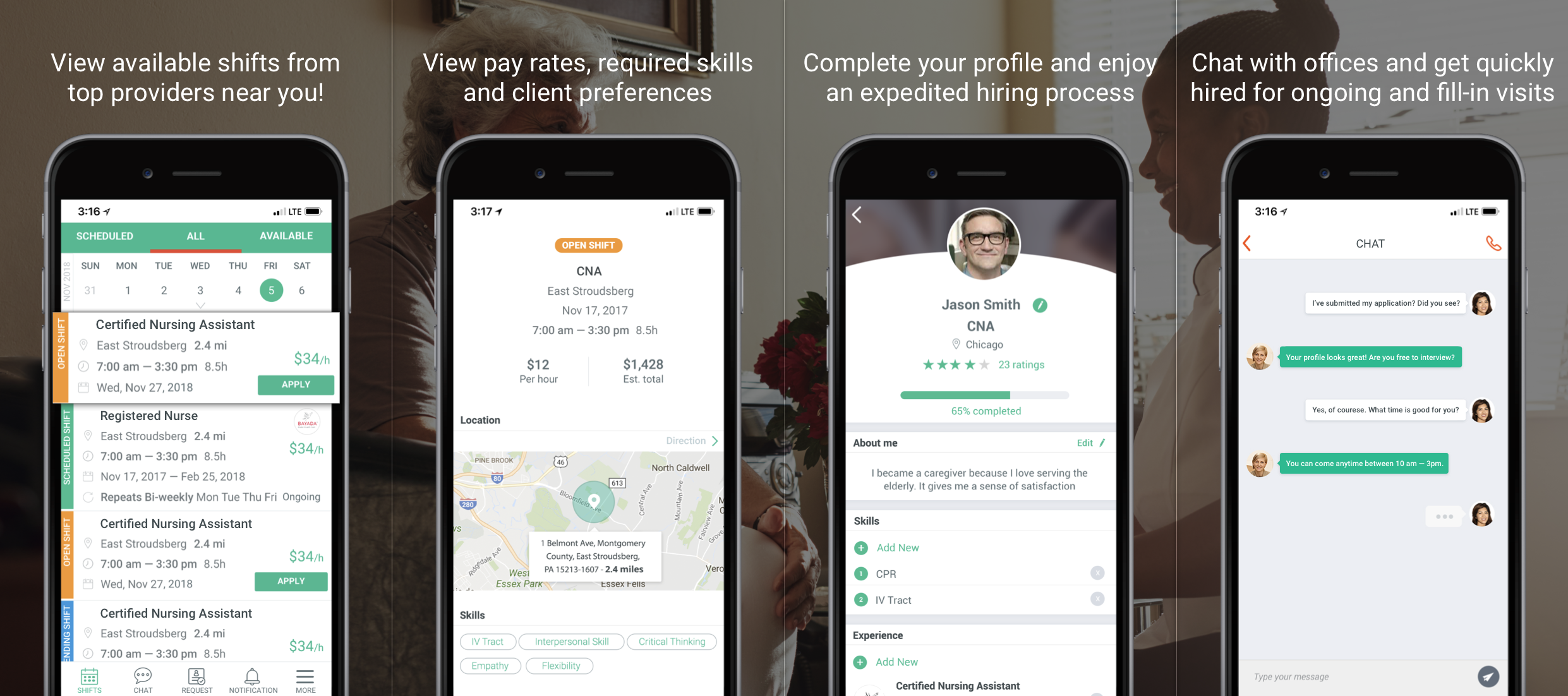
Swift Shift is a location-based mobile app that allows the best nurses and caregivers to find available shifts from leading home healthcare providers that suit their preferences. It also has its web application of workforce management SaaS platform that is integrated with home healthcare providing agencies’ systems. Swift Shift platform allows nurses to work more hours, have higher, more predictable income, and select cases that match their professional interests. Swift Shift software helps home healthcare providers market their shifts to the right people in the right way, which frees up CSMs from manually scheduling and rescheduling understaffed shifts and lets them focus on recruitment and patient management.

THE PROBLEM & THE BUSINESS GOAL
Swift Shift solves the biggest problem in home healthcare: Home healthcare providers don’t have enough people to care for their patients. Yet despite the huge shortage, nurses and caregivers aren’t being used efficiently. They aren’t working all of their available hours, spend too much time traveling to visits, and get double-booked by multiple agencies.
“Home healthcare has a massive staffing crisis; providers can’t fill shifts, while caregivers are underemployed. The root cause? Everything still runs on manual paperwork, phone calls, and inefficient scheduling.”
DESIGN PROCESS
UNDERSTAND THE USERS & EMPATHY WITH THE USERS
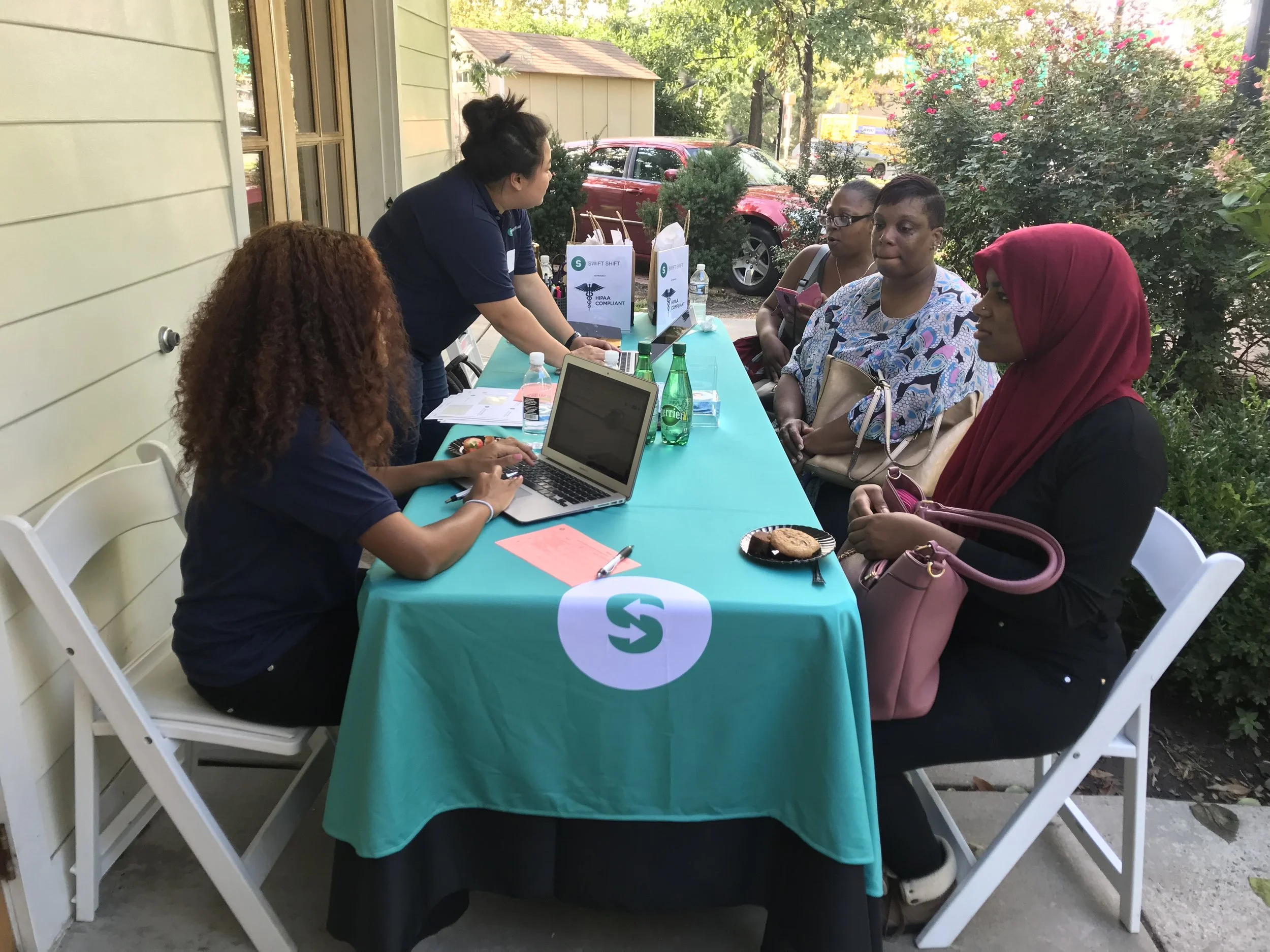
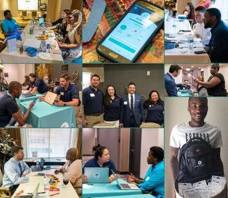
Talked to nurses, caregivers and managers of home healthcare providing agencies to understand the users: researched who they are, how they work, what are the needs and why and how they use. Learned the home healthcare industry’s significant inefficiency in terms of workforce management, nurse hiring / on-boarding process and shift scheduling.
IDENTIFY THE PROBLEMS & DEFINE THE USER’S PAIN POINTS
Due to all the manual way of paperwork and its long length of process, the nurses and caregivers aren’t being used efficiently, while there are always high-demands from patients. Also, the nurses and caregivers are saying they would like to get more open shift opportunities. Due to lack of efficiency, they are not able to work all of their available hours while spending too much time traveling to visits, and get double-booked by multiple agencies / turned out it became not available anymore or changed later.
“I spent time in the field with caregivers and agency managers and discovered two things: caregivers wanted transparency (pay, location, schedule) before committing, and managers needed to stop calling nurses one by one. The core insight was that this was a two-sided marketplace problem, not just a scheduling tool.”
USER PERSONA, USER STORY & SCENARIO
Translated research findings into user persona and user scenario. Helped everyone in the team build empathy with the two types of users: 1. Caregivers/Nurses (employee), 2. Managers from home healthcare providers.
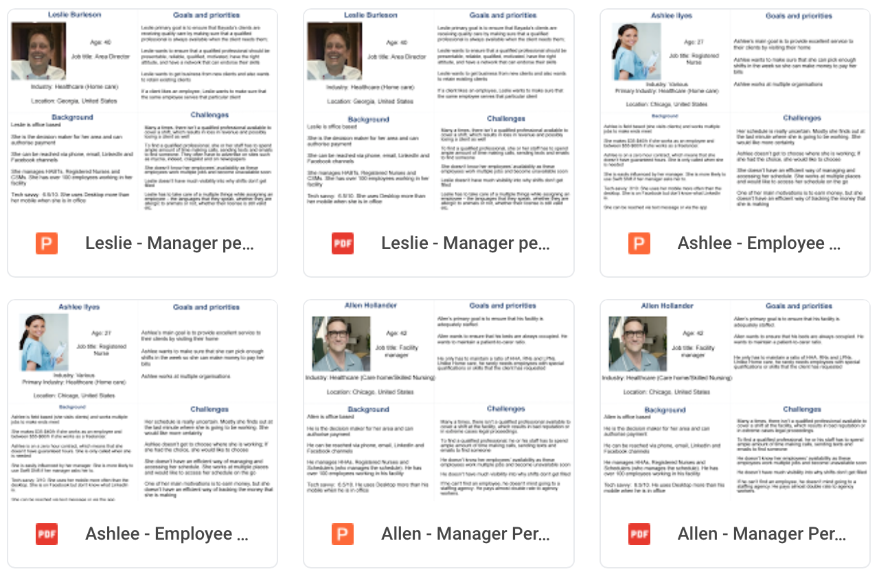
It was a two-sided marketplace: caregivers on one side, agencies on the other. Each side had different goals, different workflows, and different definitions of success. At a practical level, the information design challenge was surfacing the right shift details: pay rate, distance, time, skills required in a scannable format.
USER FLOW & WIRE FRAME
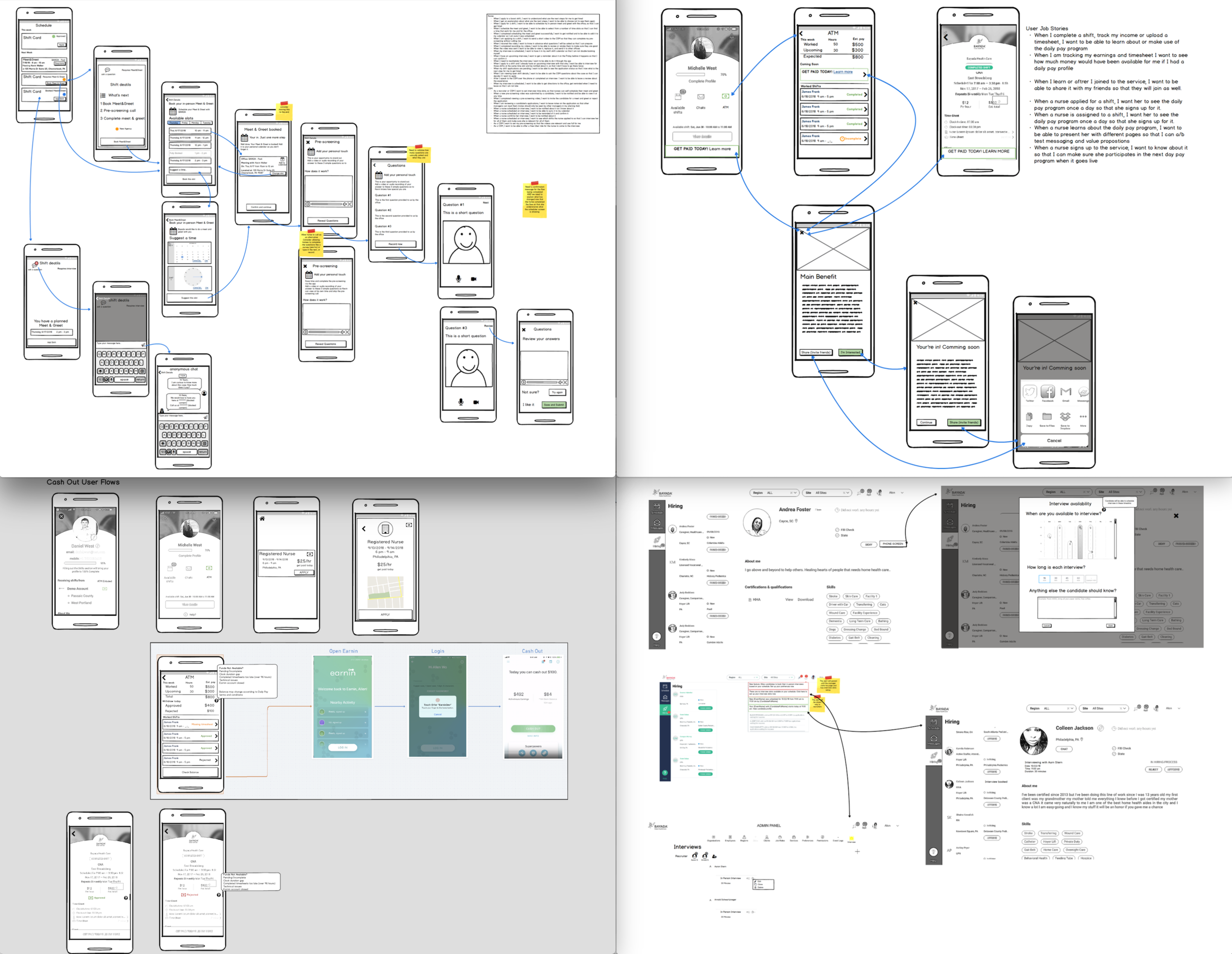
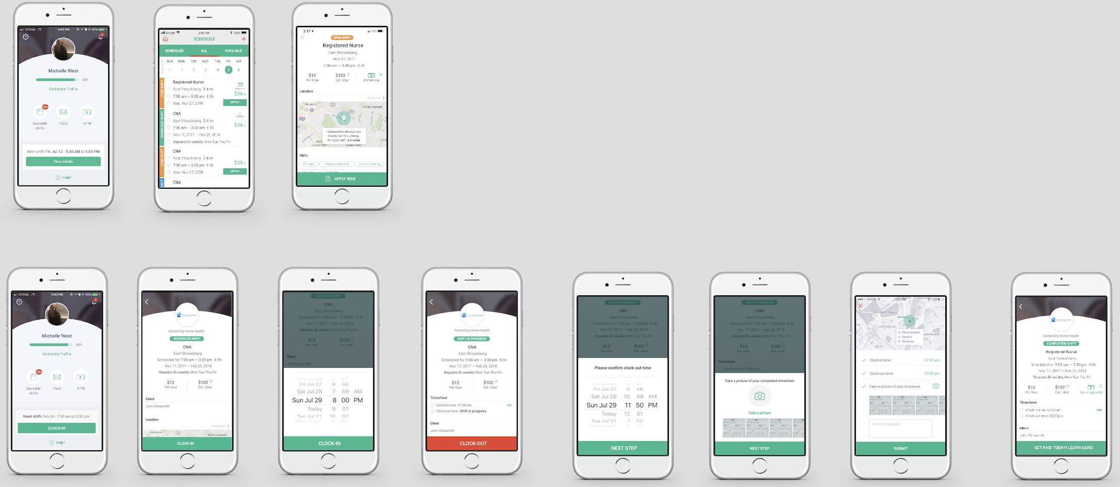
Mapped out of the user flows at a high level and figured out how those pages and features work together to impact the overall experience. Created wireframes to quickly iterate the design for each screen. Generated multiple different layout designs, navigation and information hierarchy to identify the best practice.
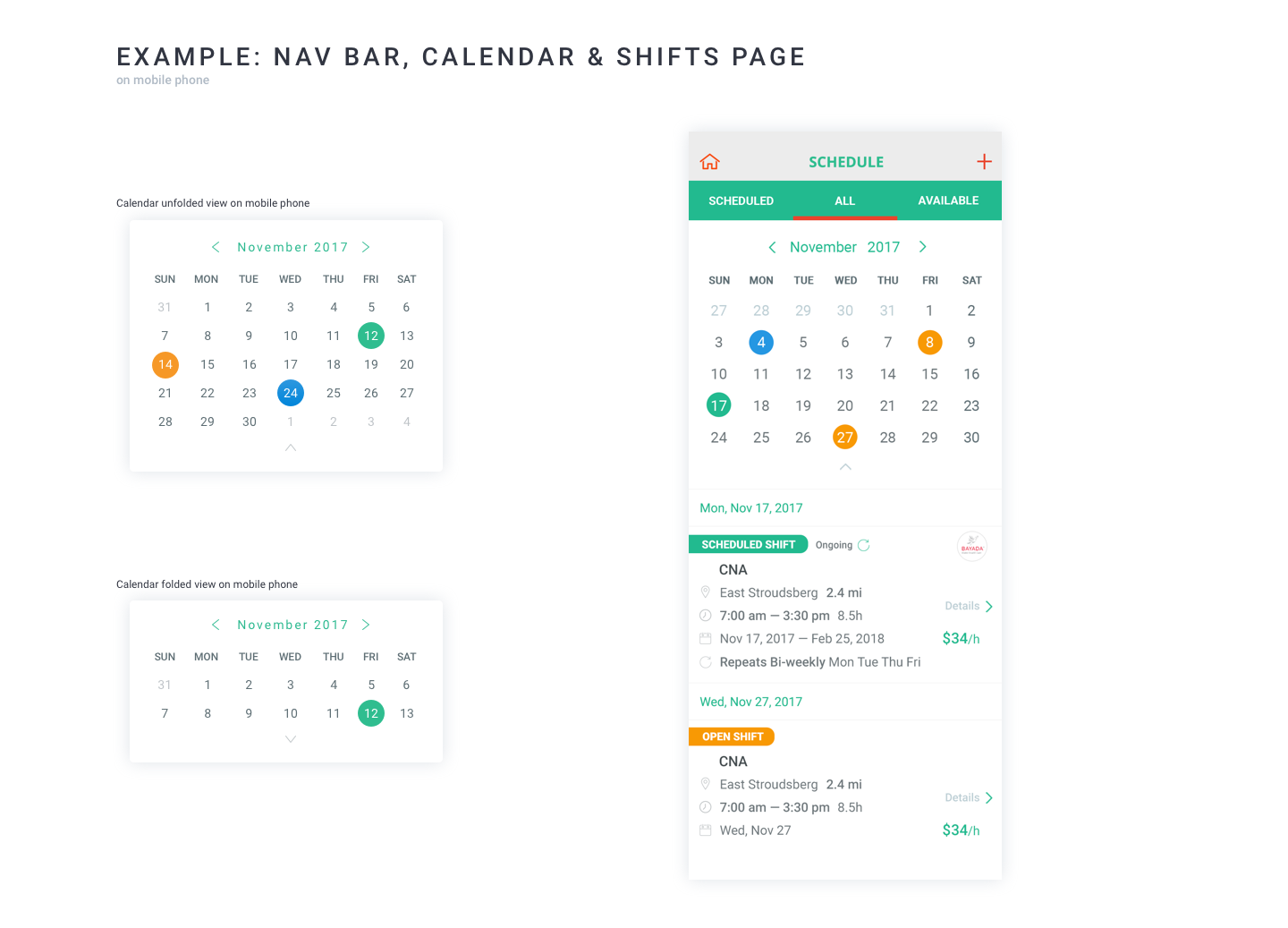
“The shift card was the most critical UI element; caregivers would scan dozens of these per session. I iterated on the information hierarchy to lead with the three things caregivers told us mattered most: pay rate, distance from home, and shift duration.”
VISUAL DESIGN & UI STYLE GUIDELINE
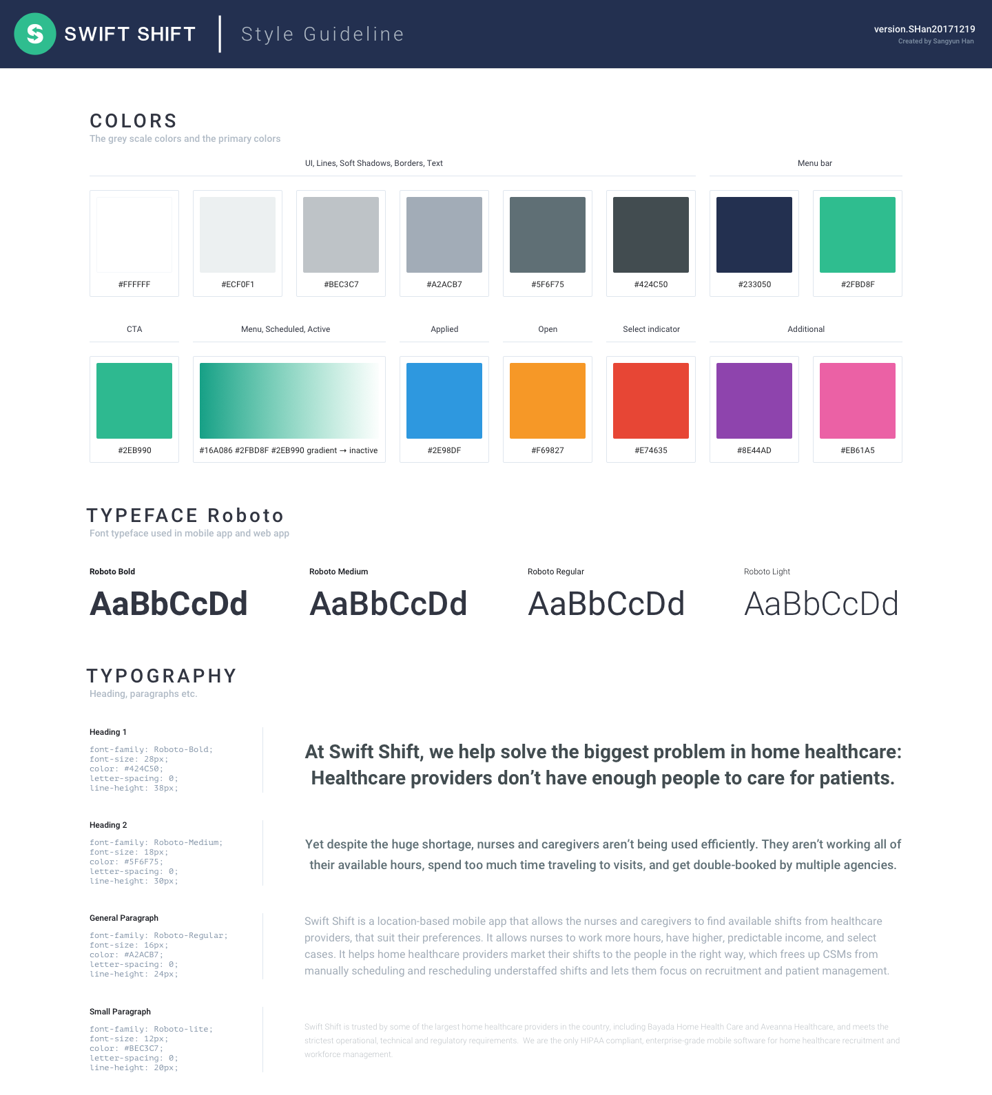
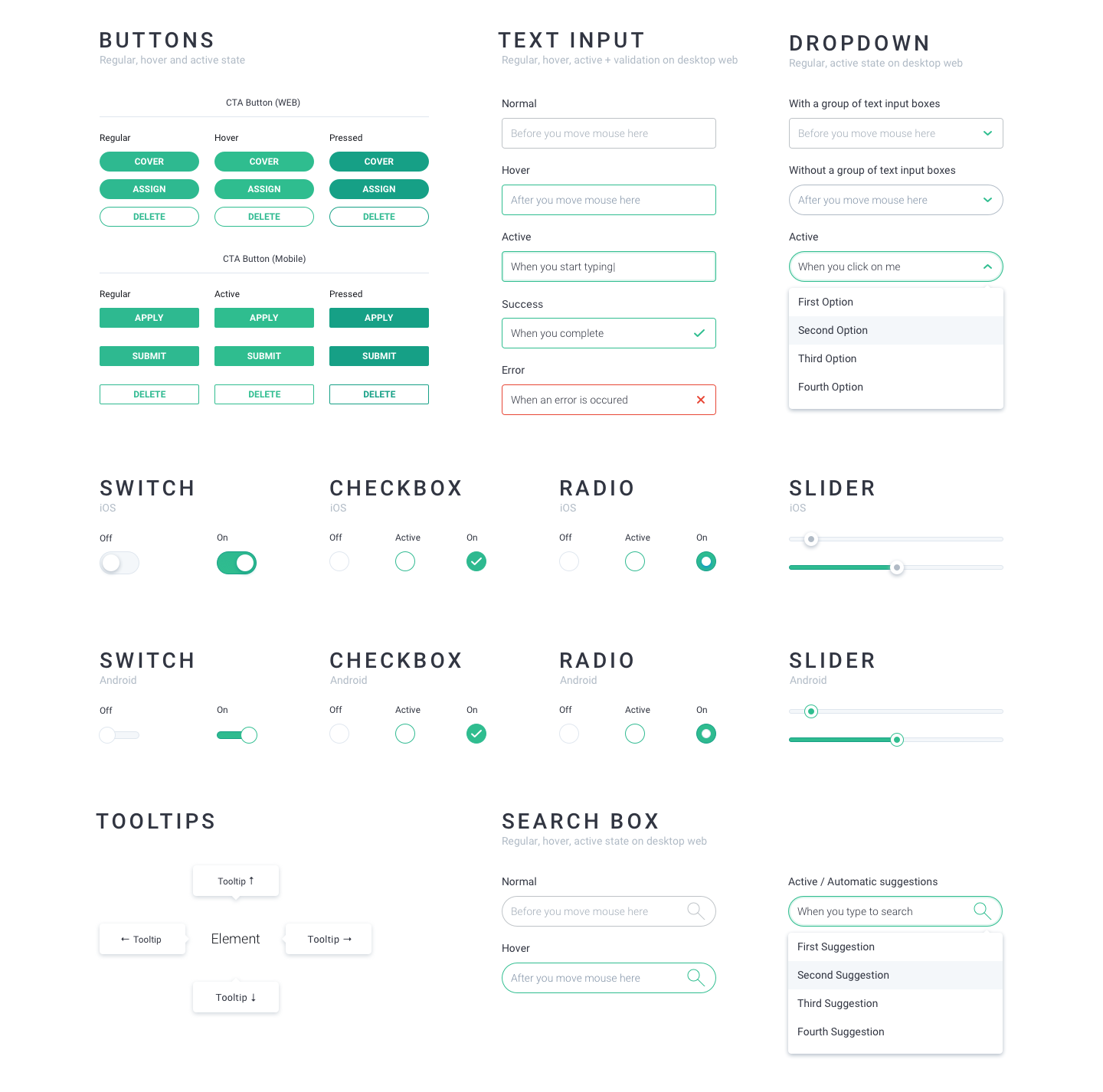
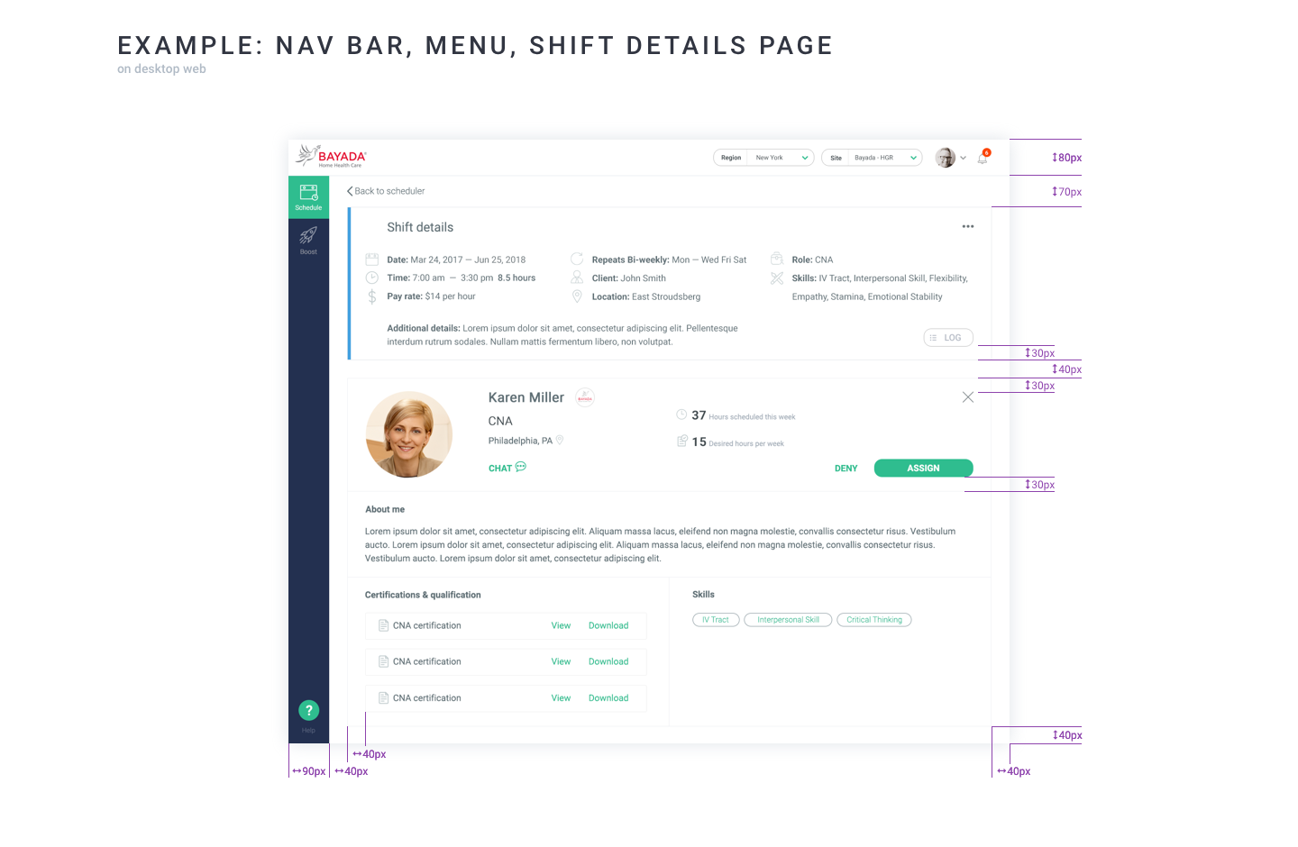
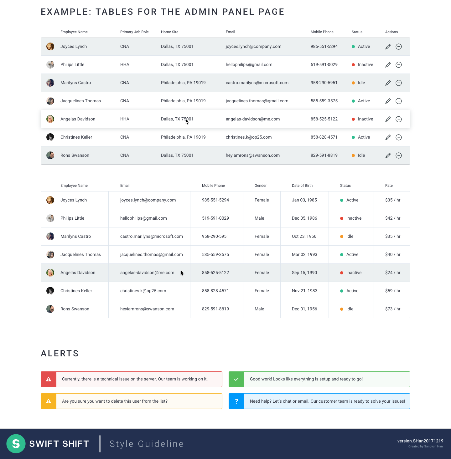
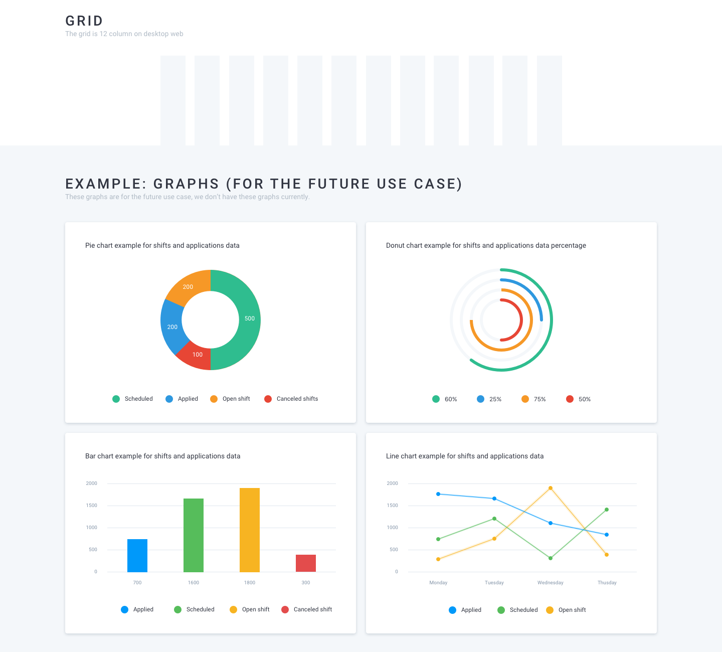
Designed, built, set and applied typography and color scheme to all pages and delivered the consistent visual language. Provided UX patterns and UI style guidelines for developer’s side to be used as a reference.
“I recognized early that it would be shipping across three platforms simultaneously. Rather than designing ad hoc, I built a style guide that reduced design-to-dev handoff friction and ensured visual consistency as the product scaled.”
HIGH-FIDELITY PROTOTYPE ➝ TESTING ➝ ITERATION CYCLE ➝ MARKET LAUNCH
Designed, built high-fidelity mock-up screens, converted visual design and multiple screens into clickable prototypes. Invited caregivers into my office and conducted multiple usability testings every 2 weeks in order to observe how they use, what they think, what things work, what things do not work, and collect their feedback. Applied that things learned from usability testings to the design and iterated the designs multiple times for launching the product to the market.
“After launch, our partner agencies reported a 20% reduction in unfilled shifts. Agency managers told us they saved 8+ hours per week on scheduling.”

I conducted biweekly in-person usability testing sessions in the office where I’d invite caregivers to try the latest prototype. I learned quickly that I needed to observe, not ask. If I asked ‘Can you find the shift details?’ they’d figure it out. But if I said ‘Show me how you’d decide whether to take this shift,’ I’d see where the interface actually failed them. The biggest insight was that caregivers made decisions based on three things in this order: distance from home, pay rate, then schedule fit. After testing, I restructured the shift card to show the location and pay clearly, which dramatically improved engagement. That lesson (test not only the individual feature, but also the holistic decision) has informed my approach ever since.
INFORMATIVE EMAIL MARKETING CAMPAIGN MOCK-UP & WIREFRAME
Designed wireframes for informative email marketing campaign by using just pen and paper. Converted the ideas from the wire frame into high-fidelity visual mock-up screens and provided design specifications.

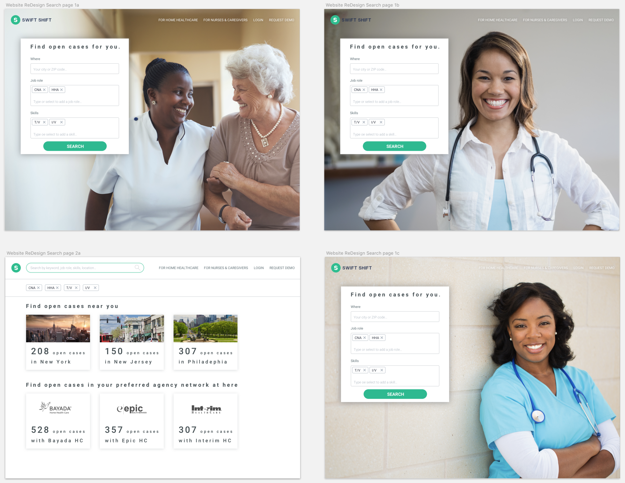
PUBLIC WEBSITE & ONLINE SEARCH PAGE
Designed the public website and its online search page for helping caregivers find the open shift cases.
SOFTWARE PRODUCT DEVELOPMENT LIFE-CYCLE & DESIGN MANAGEMENT
Managed the tasks with the team members of product managers and developers on Asana tools & JIRA.
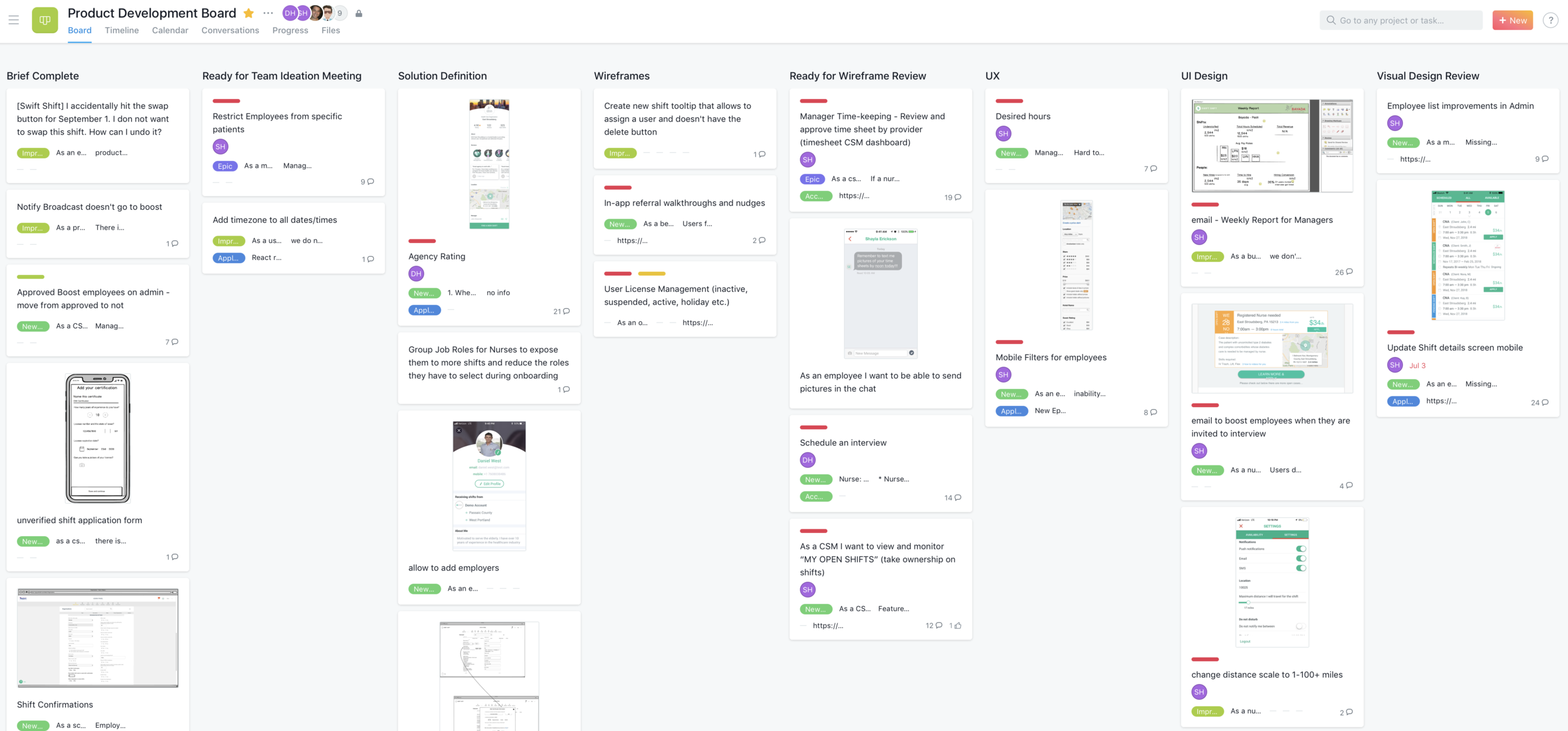
“I built the design system to ship consistently across three platforms, and established a bi-weekly user testing cadence. I also managed design delivery through Asana and JIRA and handed off pixel-level specs to engineering.”
DESIGN HANDOVER WITH SPECIFICATION
Provided the development team the high-fidelity final designs, visual assets, icons and detailed design specifications. Worked directly and closely with the development team to implement quickly and precisely.

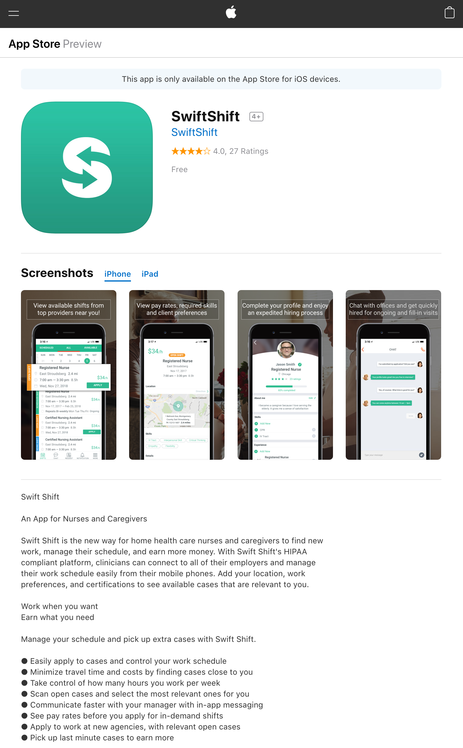
APPLE APP STORE LAUNCHING FOR iOS DEVICES
The implemented real working app is successfully listed on Apple App Store for users using iOS devices. https://itunes.apple.com/us/app/swiftshift/id949172772
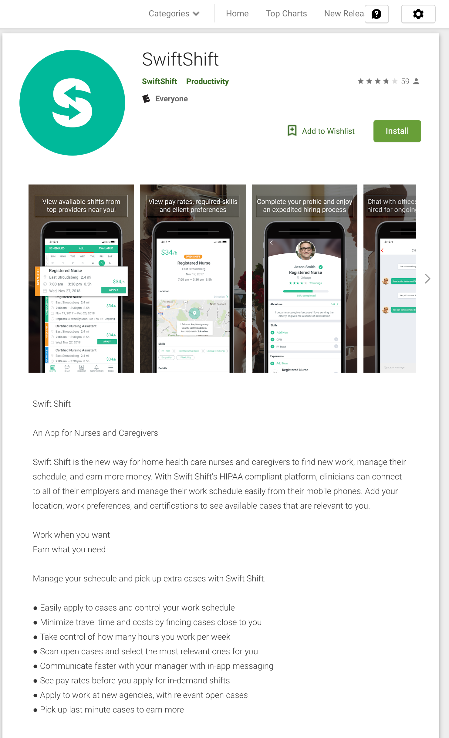
GOOGLE PLAY STORE LAUNCHING FOR ANDROID DEVICES
The implemented real working app is successfully listed on Google Play Store for users using Android devices. https://play.google.com/store/apps/details?id=com.swiftshift.employeeApp&hl=en_US
SOCIAL MEDIA & WEB MARKETING CAMPAIGN
Designed advertising campaigns for social media including Facebook, Instagram and media websites.
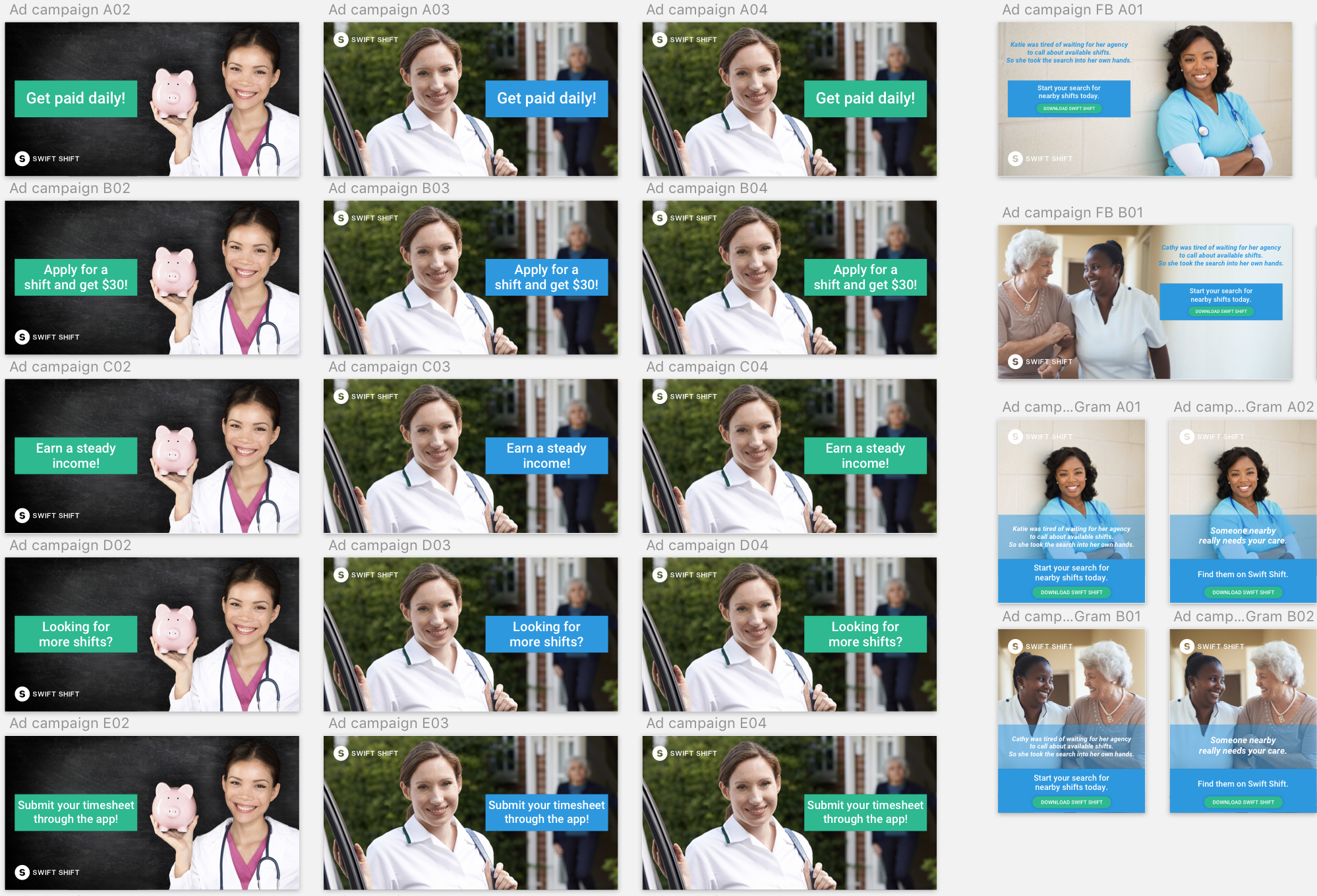
I also owned the marketing design touchpoint: email campaigns, social ads, and onboarding guides.
QUICK SETUP GUIDE
Quick setup guide is provided as part of the marketing catalogs for the customer support team.


OUTCOMES & IMPACT
Market Launch: Swift Shift shipped the mobile app successfully on both iOS and Android as a HIPAA-compliant two-sided marketplace connecting home healthcare caregivers with leading home healthcare providers.
Operational Efficiency: Optimized workforce scheduling, achieving a 20% reduction in unfilled shifts and saving managers 8+ hours per week.
Public Ratings: 4.0 stars on the Apple App Store (27 ratings) and approximately 4 stars on Google Play (59 ratings) on the 1st week.
Scope: As the sole UX/UI designer, owned the complete product experience across three surfaces; the iOS mobile app, the Android mobile app, and the web-based SaaS workforce management platform used by home healthcare agency managers. Also designed every supporting touchpoint: email marketing campaigns, social media ad campaigns across Facebook and Instagram, the public-facing caregiver recruitment website, and the quick-setup onboarding guides used by customer support.
Research-Driven Design: Conducted biweekly in-person usability testing sessions with caregivers throughout the project; a diverse population in age, language background, and digital literacy. This direct observation shaped the final product’s core design decisions, including the shift card information hierarchy (leading with location, pay rate, and schedule; the three factors caregivers consistently identified as driving their decisions).
Design System: Built the complete Swift Shift UI style guide covering typography, color, components, grids, iOS and Android native controls, alerts, and data visualization patterns; establishing the visual language that carried across mobile, web, and marketing materials.