Case Study 0: RBC Clear
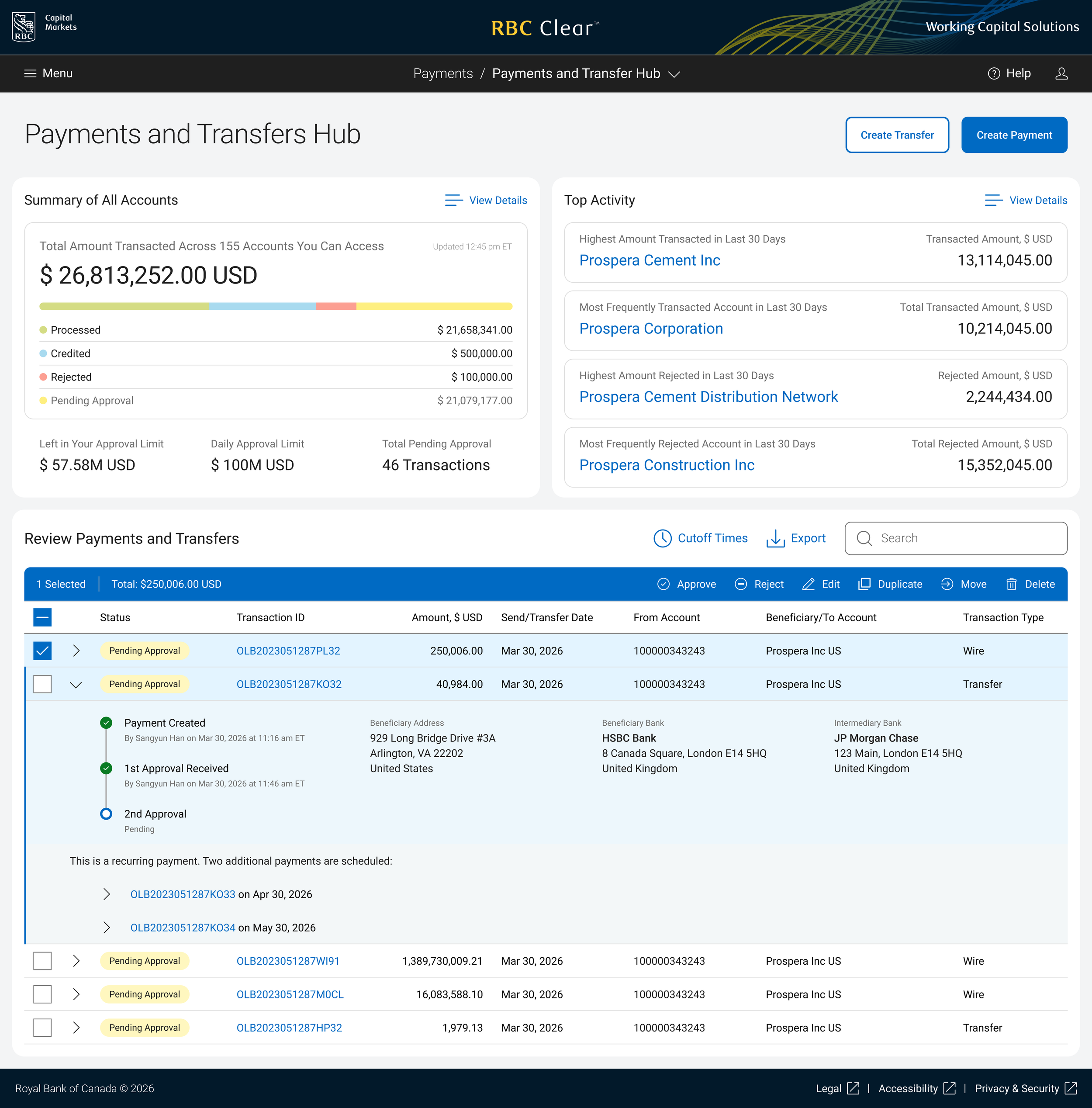
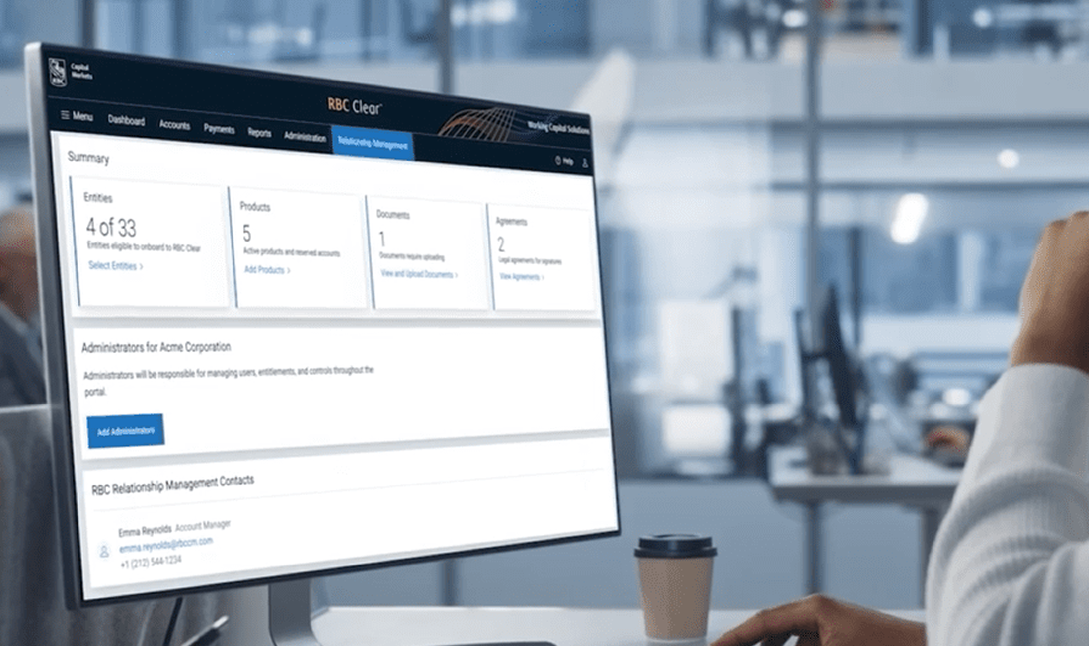
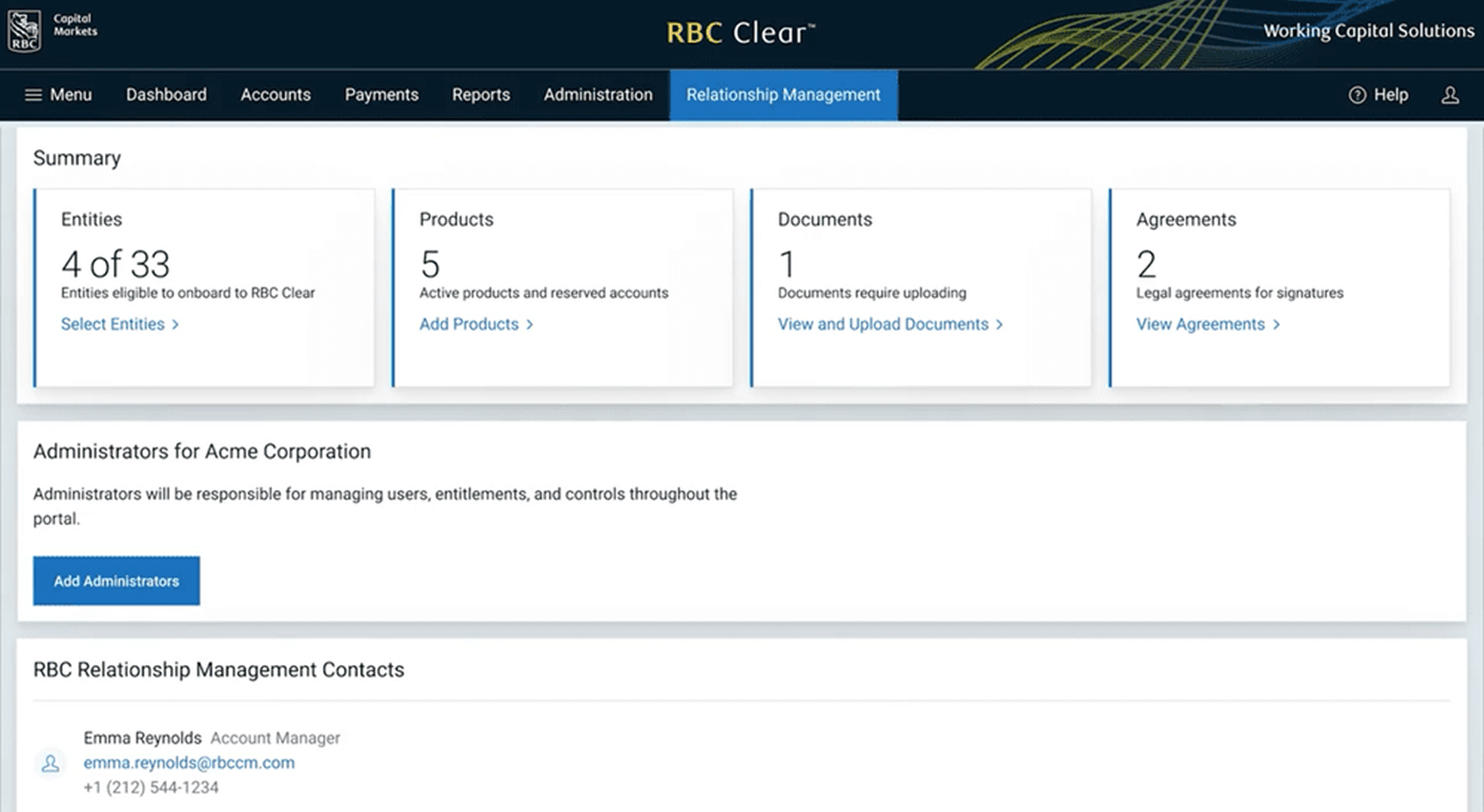

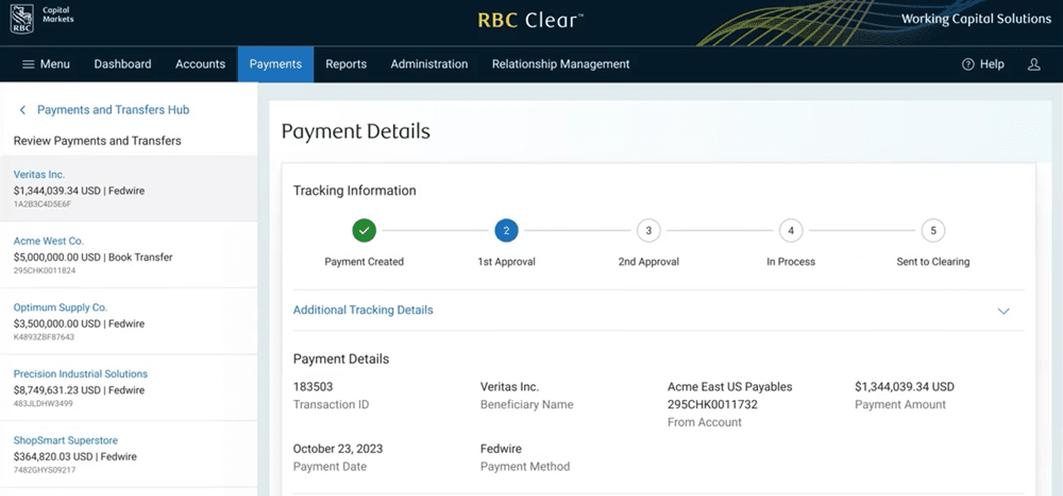
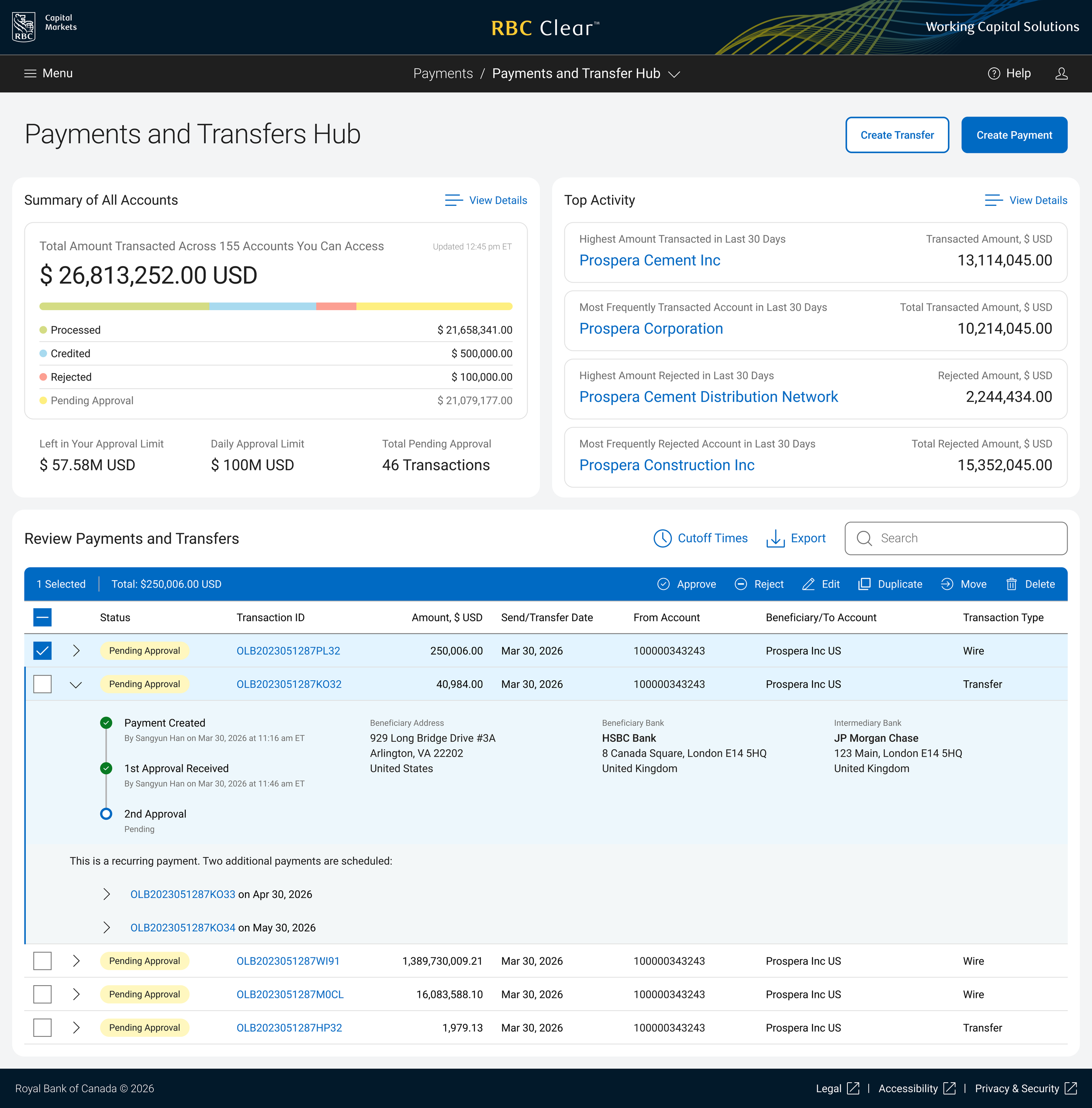
RBC Clear™ Digital Cash Management Platform
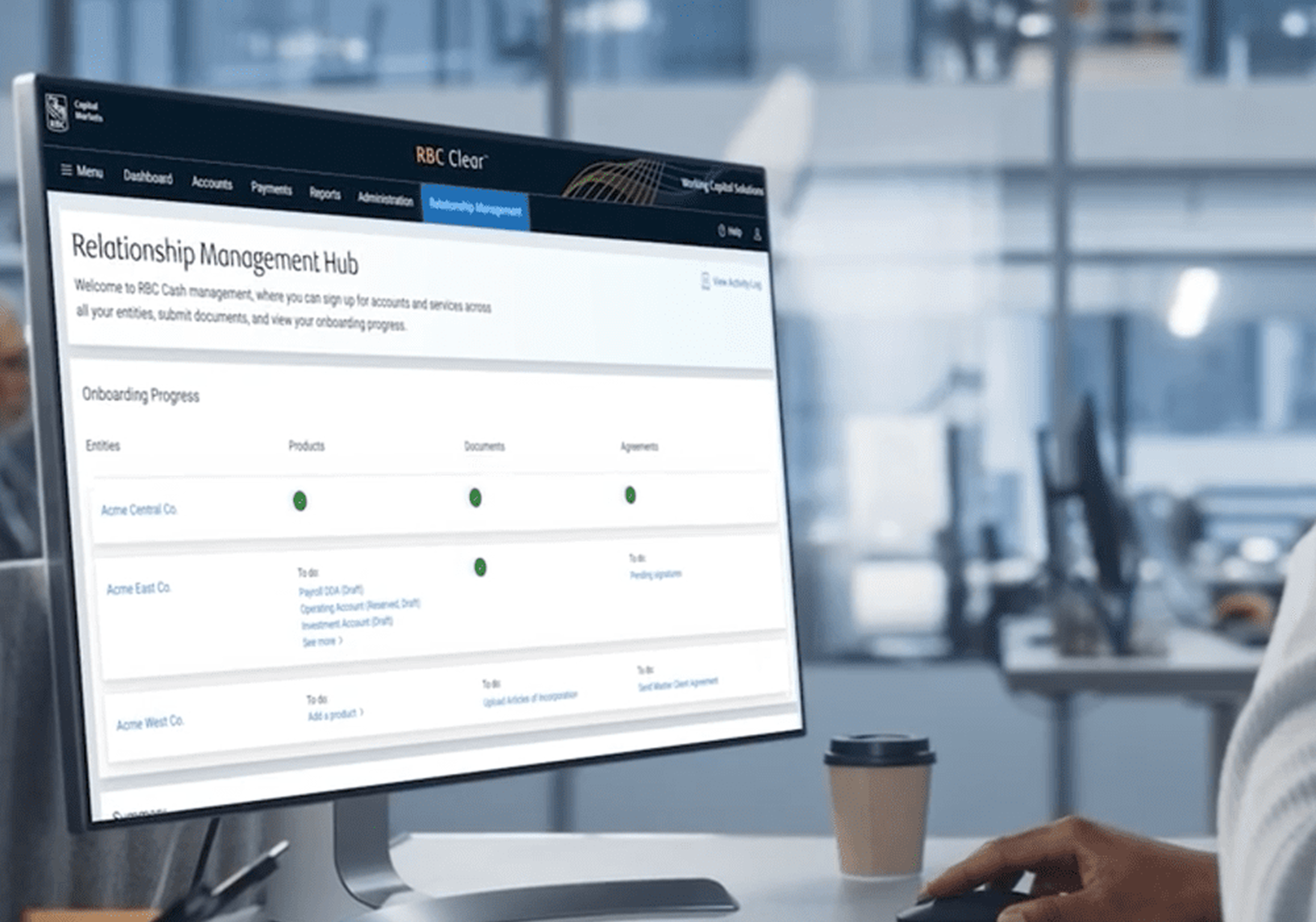
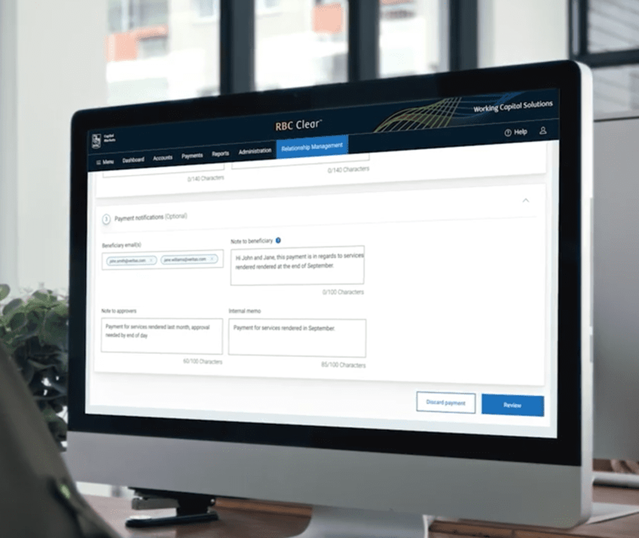
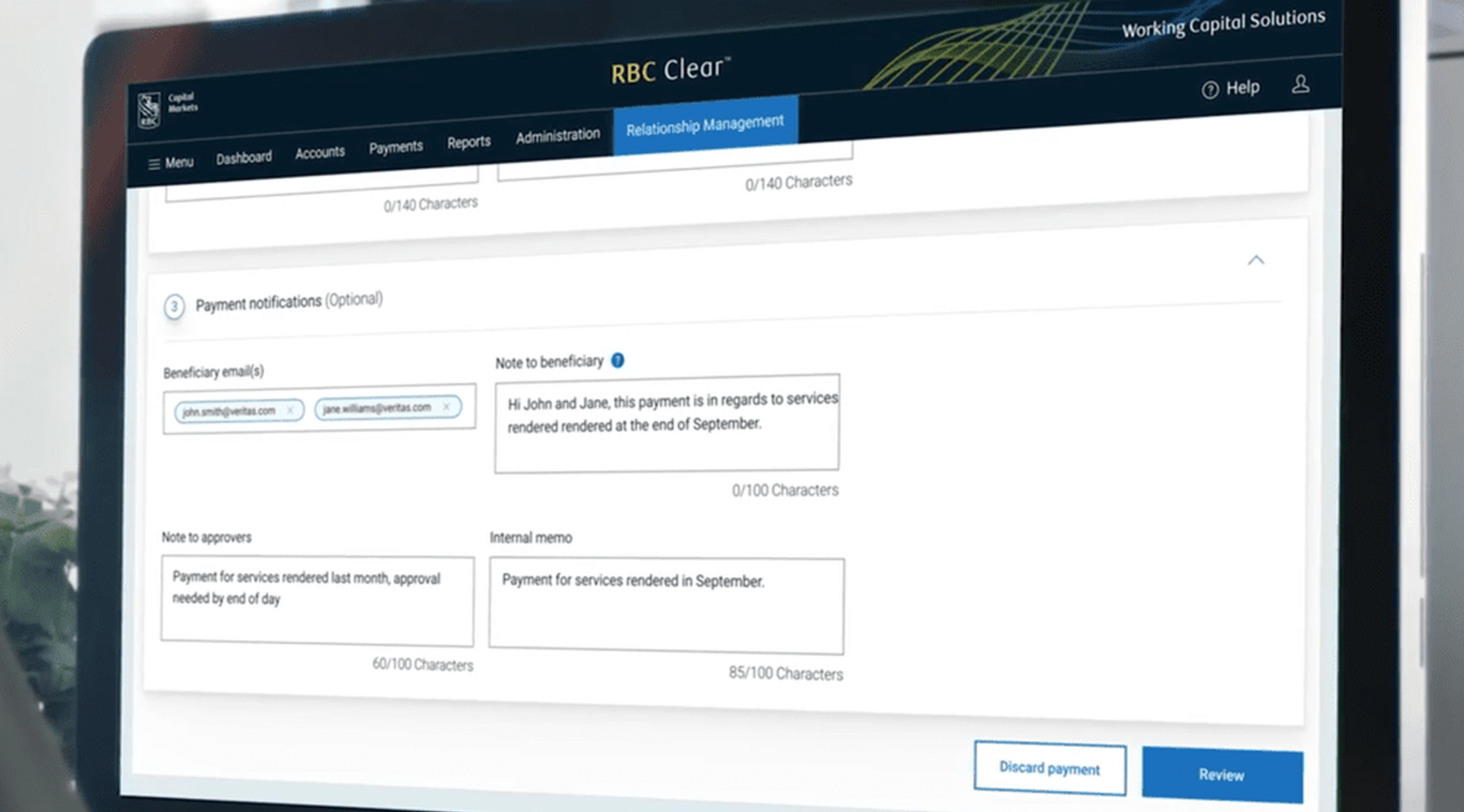
The screens shown here are my designs using the RBC Clear Design System I built. Due to RBC information security, design artifacts cannot be extracted to outside from Figma. The screens shown here are publicly released marketing materials which featured my designs.
My Role & Contribution:
I Joined the RBC Clear team as the first design hire, spearheading the design and launch of the new cloud-native cash management platform. Designing the web portal, high-value payment tools, and FX tables; building, owning and scaling Clear Design System which resolved design-to-development bottlenecks by scaling a unified library with an 80% reuse rate and accelerating engineering velocity (The development team lead’s report on Storybook, our shared code repository which showed an 80% component reuse rate. The Storybook components were built from the Figma design system component library I created and maintain. The RBC Clear Design System I built provided the foundation for the engineering team to build reusable code components, which is what reduces development friction and makes shipping faster).
Outcome:
Progressed from 2023 Beta to the 2024 launch; by 2026 Q1, achieved AUM growth from $0 ➝ $23B, and accelerated onboarding for high-profile corporate treasurers from 45 days ➝ as little as 1 day. It was reported in a Wall Street Journal interview with the Head of RBC Clear. To be clear about my role, the AUM growth comes from multiple teams’ effort, not design alone. It came from cross-functional execution; business, sales, client services, design, engineering, legal and compliance all contributed. What design more contributed was a streamlined portal experience that helped reduce corporate treasurer onboarding time, which removed a major friction point in client acquisition. So design was a meaningful part of the equation that produced it.
Process & 5 Key Design Points:
Onboarding ultra-high-profile corporate treasurers to a professional cash management platform like RBC Clear is less about "signing up" and more about complex data orchestration and trust building.
The leap from the usual 45-day to as little as 1-day onboarding process also required cross-functional team collaboration to solve for these critical areas:
1. The "User-Centric" Approach
The design focused on eliminating onboarding friction for high-profile corporate treasurers by providing a self-service "Hub" that streamlined document submission and real-time verification, saving weeks of manual effort.
UX Strategy: My goal was to reduce complexity, eliminate manual tasks, and immediately deliver trust. Once onboarding completed, the dashboard should show live cash balances across all connected institution accounts on day one.
UI Element: A white-glove approach that prioritizes security, speed, and deep data visibility. Corporate treasurers are busy. The UI needs to ensure they can save their progress and resume onboarding later without losing information.
2. Progressive Disclosure of "Heavy" Data
Corporate onboarding requires massive amounts of documentation (KYC, AML, Articles of Incorporation, Tax IDs).
UX Strategy: Unlike general consumer apps, treasury management platform must prioritize efficiency and a clear information hierarchy, the interface should be precise, accessible and functional for business users. Every pixel must have purpose. Also, instead of presenting a 50-field form, I used stepper-based flows that save progress automatically.
UI Element: I created an Onboarding Checklist "Hub" that shows exactly what is completed and what is pending (e.g., "Awaiting Legal Review" vs. "Action Required"), and also the Proactive Status Tracking to shows where the client is in the process, what is required next, and who is responsible.
3. Role-based Permissions & Multi-Entity Setup
Treasurers often manage multiple legal entities, sub-accounts, and members with different levels of access.
UX Strategy: I designed to provide "Bulk Actions" and "Templates" that allow a treasurer to set up one entity’s permissions and "Apply to All" other sub-entities.
UI Element: An Organizational Tree View that allows users to visualize their entire corporate structure and permissions across different regions or accounts.
4. Integrated Security & Compliance (Trust UI)
High-profile users are hyper-sensitive to security. If a screen looks "too retail" or "too casual," they may lose trust in the platform’s institutional-grade safety.
UX Strategy: Embed Contextual Explanations for why sensitive data is needed (e.g., "This protects your account under the Patriot Act"), with the help from the legal team.
UI Element: I intentionally used a "dark blue and royal blue" color palette that feels like a professional "Financial Command Center" rather than a casual social media app.
5. Third-party Data Integration (Smart Sync)
The primary bottleneck in 45-day onboarding is usually manual document verification.
UX Strategy: "Smart Imports" where the platform pulls data directly from a corporate’s ERP (SAP or Oracle) & bank-to-bank (Host-to-Host) via API.
UI Element: Real-time Status Syncing. Instead of a static screen, I used a live feed of backend verification steps so the user knows the system is working in the backend.
Due to NDA, details are limited. Please contact me to learn more!
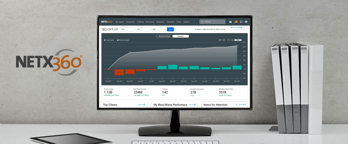
FINANCIAL ADVISOR PLATFORM
Financial advisors were using a fragmented legacy platform; they had to piece together tools across multiple application screens to serve their clients.
I was brought in to reimagine the core experience into a unified platform that lets financial advisors work seamlessly with everything they need in one place.
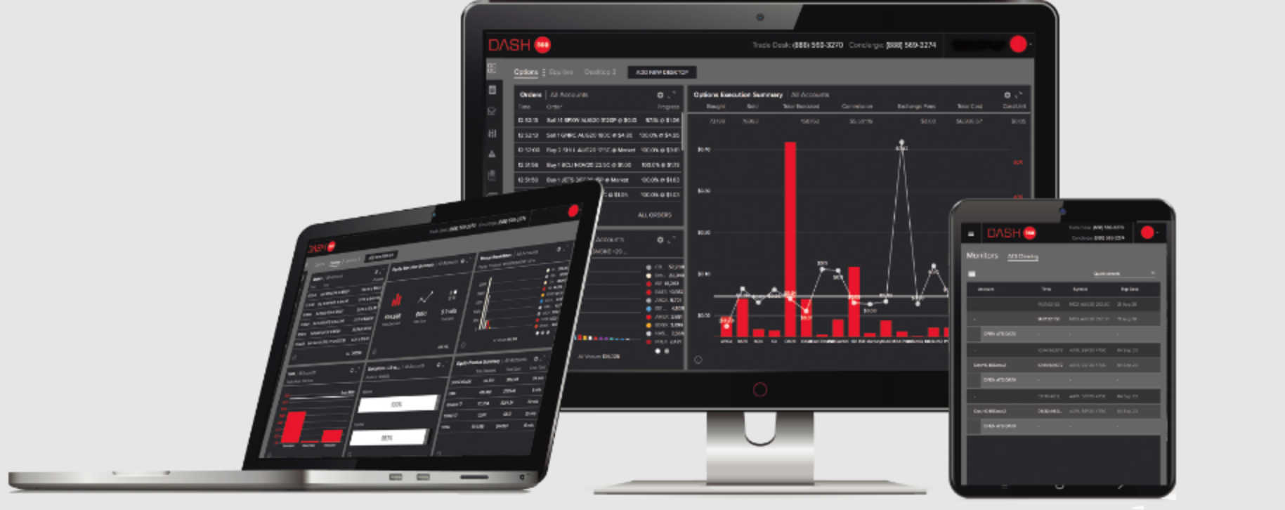
TRADING ANALYTICS PLATFORM
Traders execute thousands of orders per day across multiple exchanges via high-frequency trading (HFT) algorithms; they had raw data, but no way to visually understand execution quality in real time.
I was brought in to design the visualized order execution analytics platform that turns data into actionable insight.
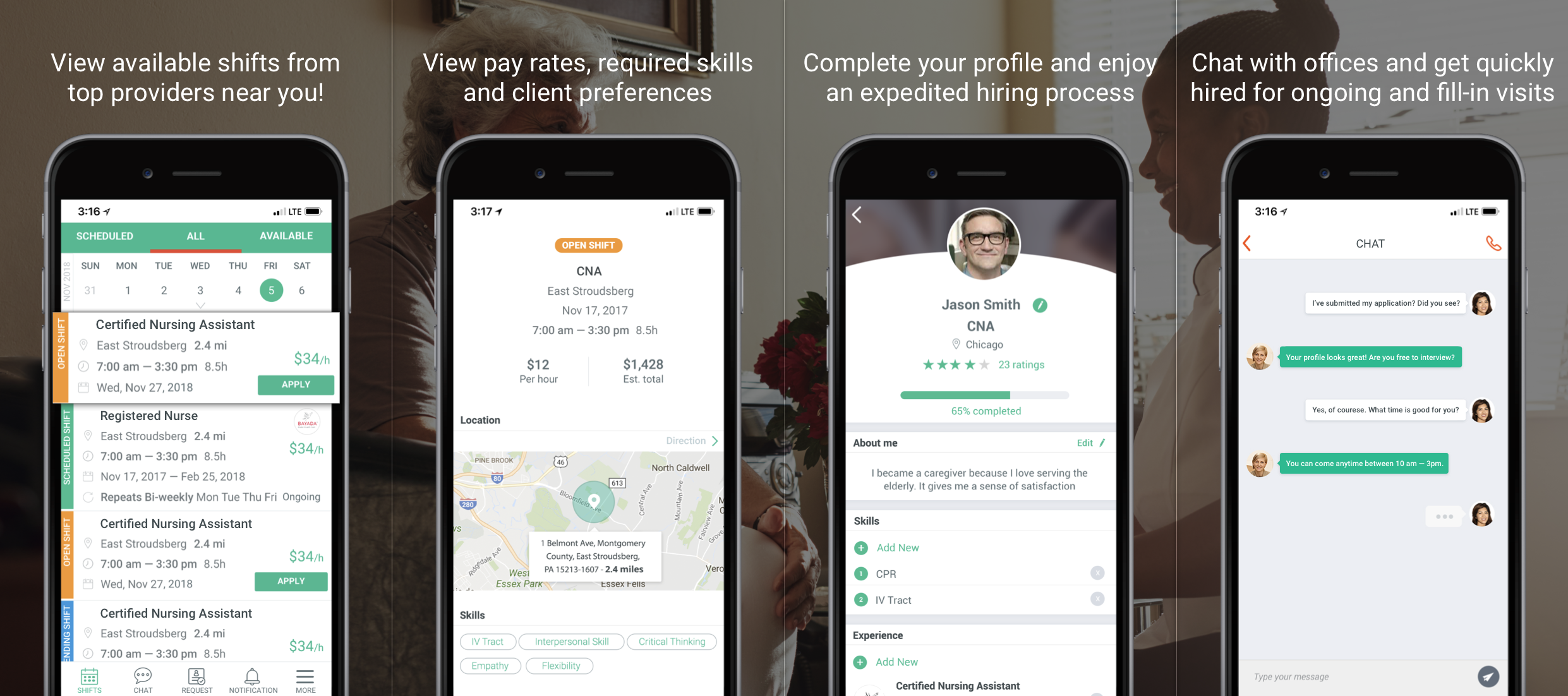
CAREGIVER MOBILE APP
The staffing crisis in home healthcare. Providers can’t fill shifts. Caregivers want more work but the process is broken; manual, phone-based, and inefficient.
I was brought in to design the entire B2C marketplace platform from 0 ➝ 1: the caregiver-facing iOS, Android app, and the agency-facing management SaaS platform.