Case Study 2: Dash Financial

CASE STUDY 2: DASH FINANCIAL
My Role & Contribution: UX/UI Designer. Designed the DASH360 analytics platform; high-frequency options trading tools, and custom data-visualization widgets.

OVERVIEW
DASH360® is a web-based analytics, visualization and workflow application for providing the clients real-time transparency and insight into HFT high-frequency electronic algorithmic trading order execution.


When a trading desk executes an order (like buying 10,000 shares of Apple) that order gets routed across multiple stock exchanges algorithmically. DASH360® gives traders real-time visibility into how those orders are being executed: which exchanges, at what prices, how fast, and how that compares to the market. Think of it as a performance dashboard for trading execution quality. The core design challenge was turning massive, real-time data streams into visualizations that traders could read in seconds while under pressure.
THE PROBLEM & THE BUSINESS GOAL
For trading orders, having a massive amount of data is one thing, but being able to consume it and learn from it is another level of transparency. The goal is to empower the clients with the necessary data to make informed and actionable execution decisions to cater to performance needs.
“Traders execute thousands of orders per day across multiple exchanges. They had raw data, but no way to visually understand execution quality in real time. I designed the visualized analytics layer that turned data into actionable insight.”
DESIGN PROCESS
UNDERSTAND THE USERS & DEFINE THE USER’S PAIN POINTS
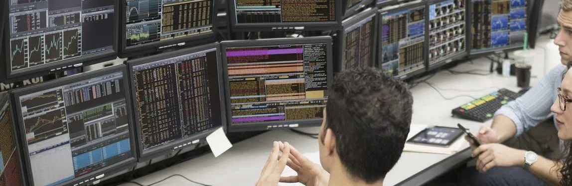
Talked to the users (the traders) in the market to understand the users: researched who they are, how they work, what are the needs and why and how they use. Learned that the traders are handling a large amount of orders and are watching multiple monitors all day long. It is a stressful work environment due to the orders trading high value of money in real-time and the market situation changes frequently. They need to analyze and act fast. It requires tools for quick overview of the order execution and in order to display the information, the data visualization is an important feature to the users.
DETERMINE USER FLOWS & REQUIREMENTS
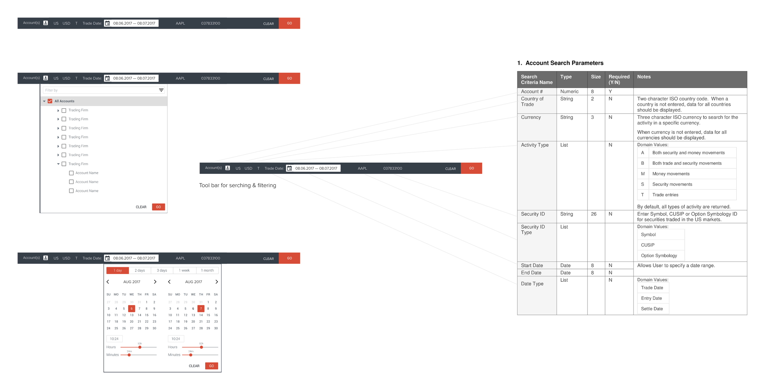
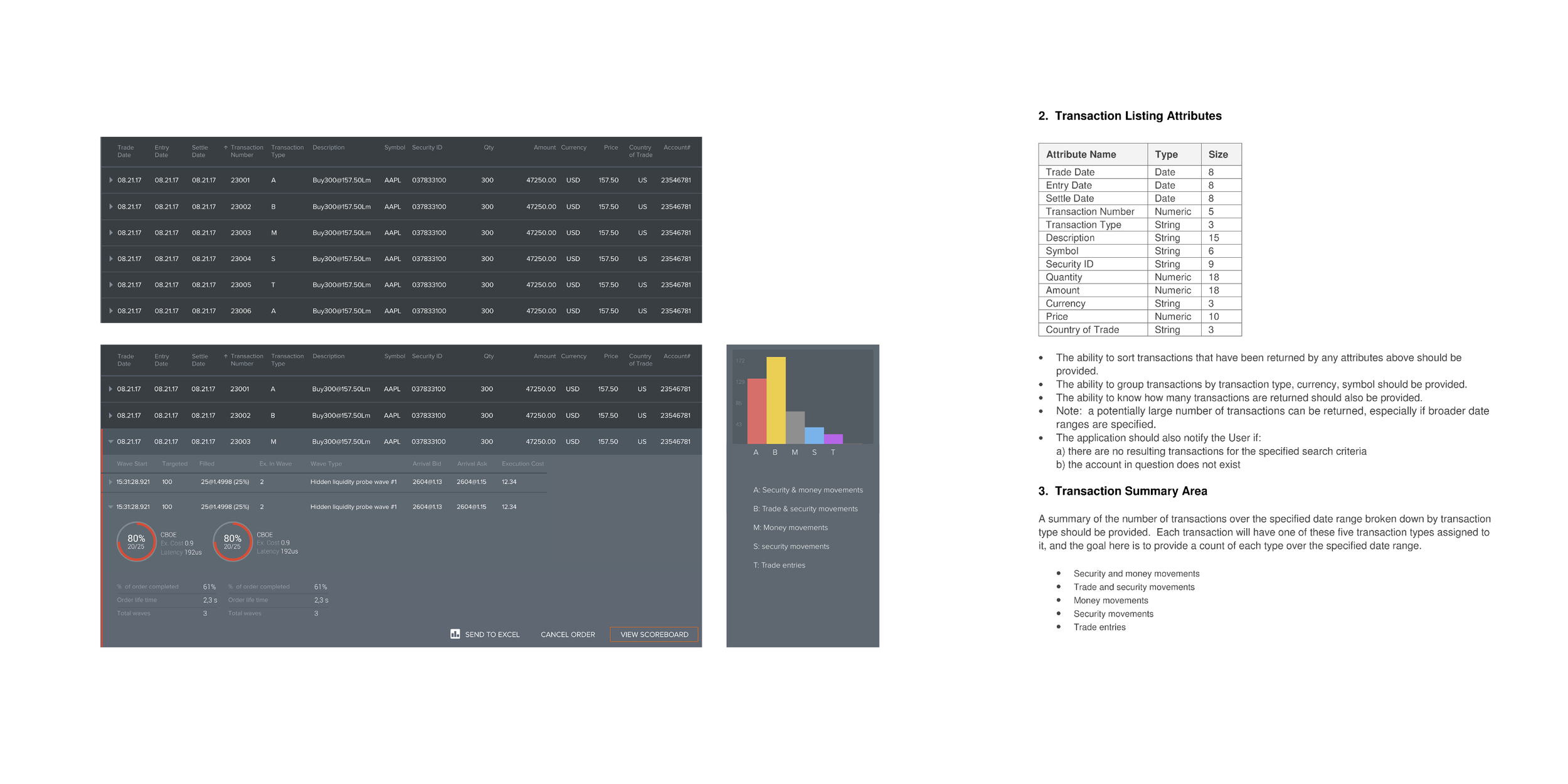
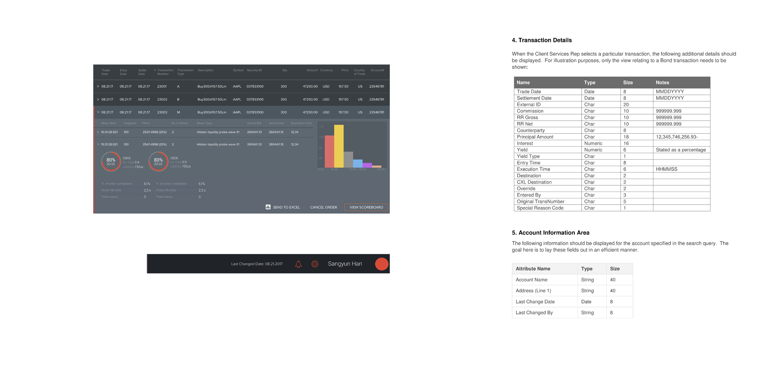
Mapped out of the user flows at a high level and figured out how those pages and features work together to impact the overall experience. Created wireframes and multiple different layout designs, navigation and information hierarchy to identify the best practice.
DESIGN SPECIFICATION & UI STYLE GUIDELINE
Designed, built, set and applied typography and color scheme to all pages and delivered the consistent visual language. Provided UX patterns and UI style guidelines for developer’s side to be used as a reference.
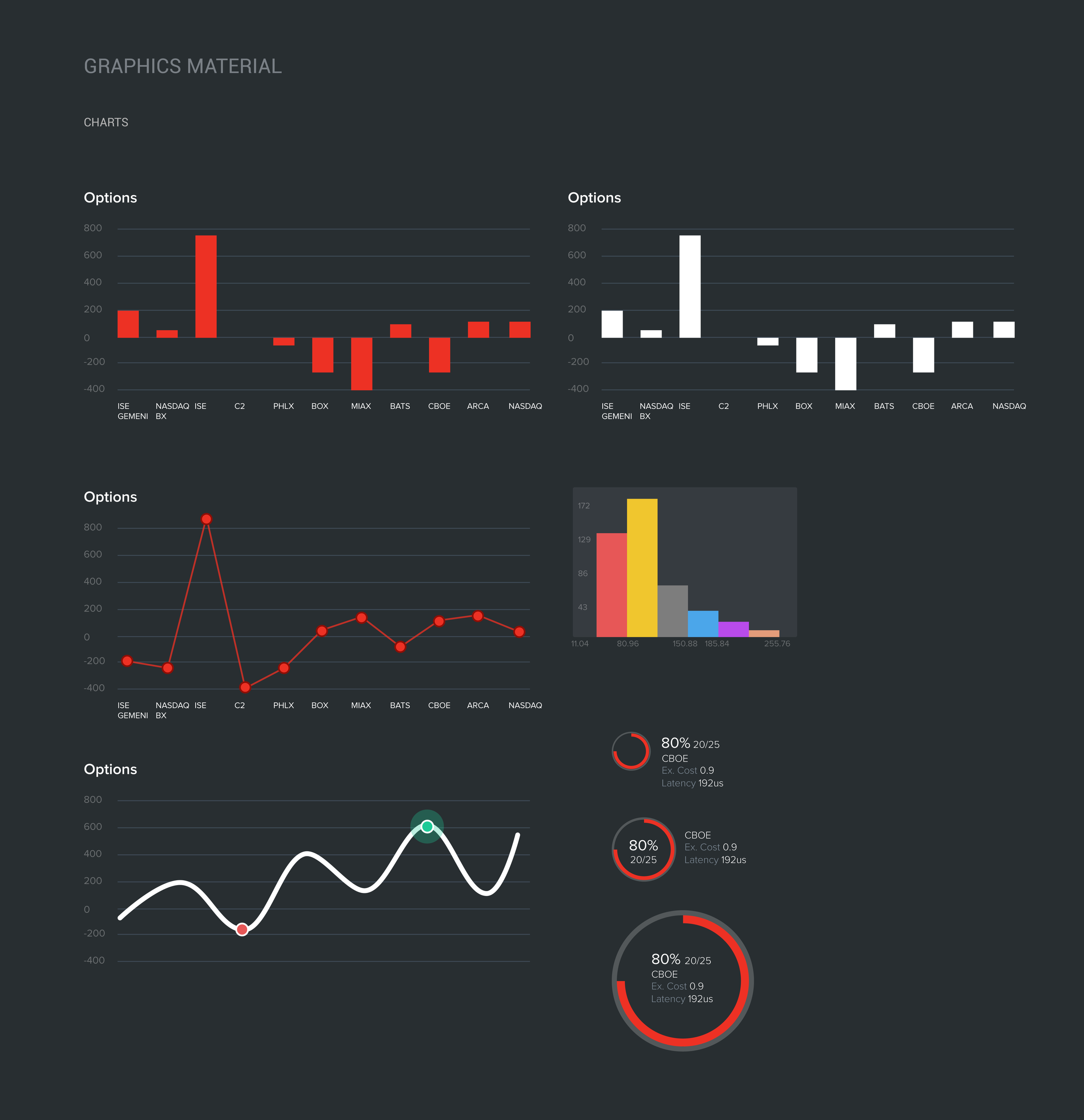
DASH360 - UI Style Guideline - Graphics Material
“Dark UI themes for trading platforms require careful attention to contrast, color accessibility, and reducing visual fatigue.”
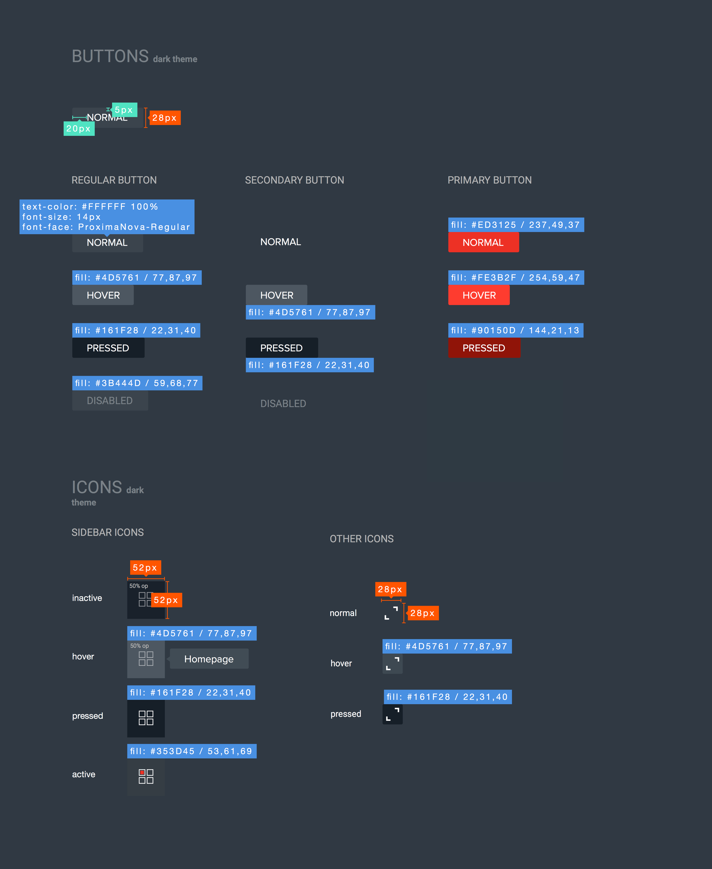
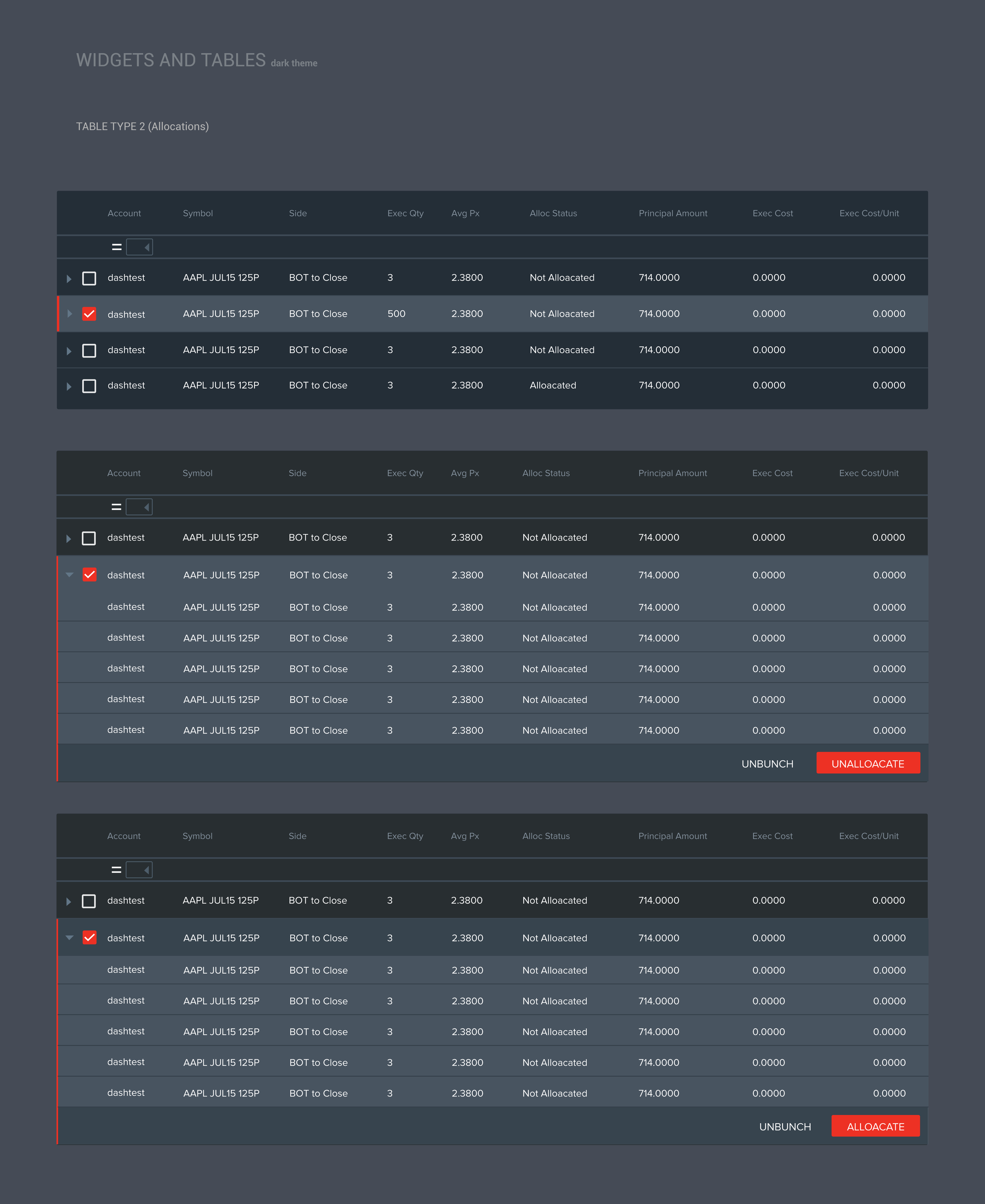
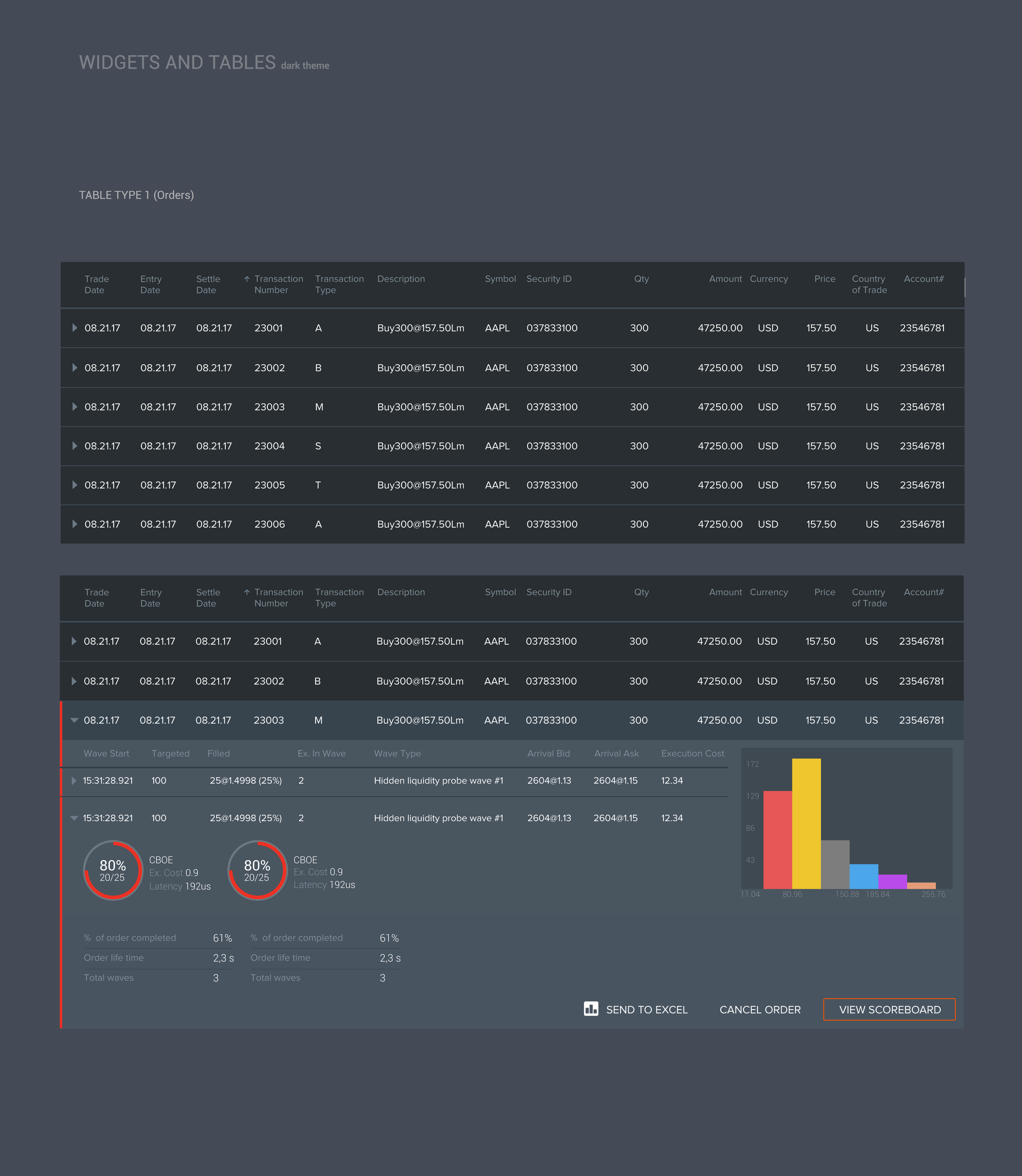
Dark UI themes for trading platforms aren’t just an aesthetic choice; they’re a functional requirement. Traders sit in front of 6-8 monitors for 8+ hours in often dimly lit trading floors. I observed the traders sitting right next to me every day, and I noticed that the old legacy product’s bright interface causes eye fatigue and makes it harder to scan across monitors quickly. I designed the entire color system around a dark background with carefully calibrated contrast ratios. The key challenge was the data visualization palette. On a dark background, many standard chart colors become unreadable or visually ambiguous. I created a custom palette where red is reserved exclusively for critical states (in trading, red means something needs immediate attention). Neutral data uses grays and grayish dark green blue colors. Completed signals use greens sparingly. I tested every visualization component for readability at typical desk viewing distances, which is about 24–30 inches away.
HIGH-FIDELITY PROTOTYPE ➝ TESTING ➝ ITERATION CYCLE ➝ MARKET LAUNCH
Designed, built high-fidelity mock-up screens, converted visual design and multiple screens into clickable prototypes. Met with real users to conduct usability testings and collected their feedback. Applied the feedback from usability testings to the design iterations for launching the product to the market.

DASH360® Main Dashboard
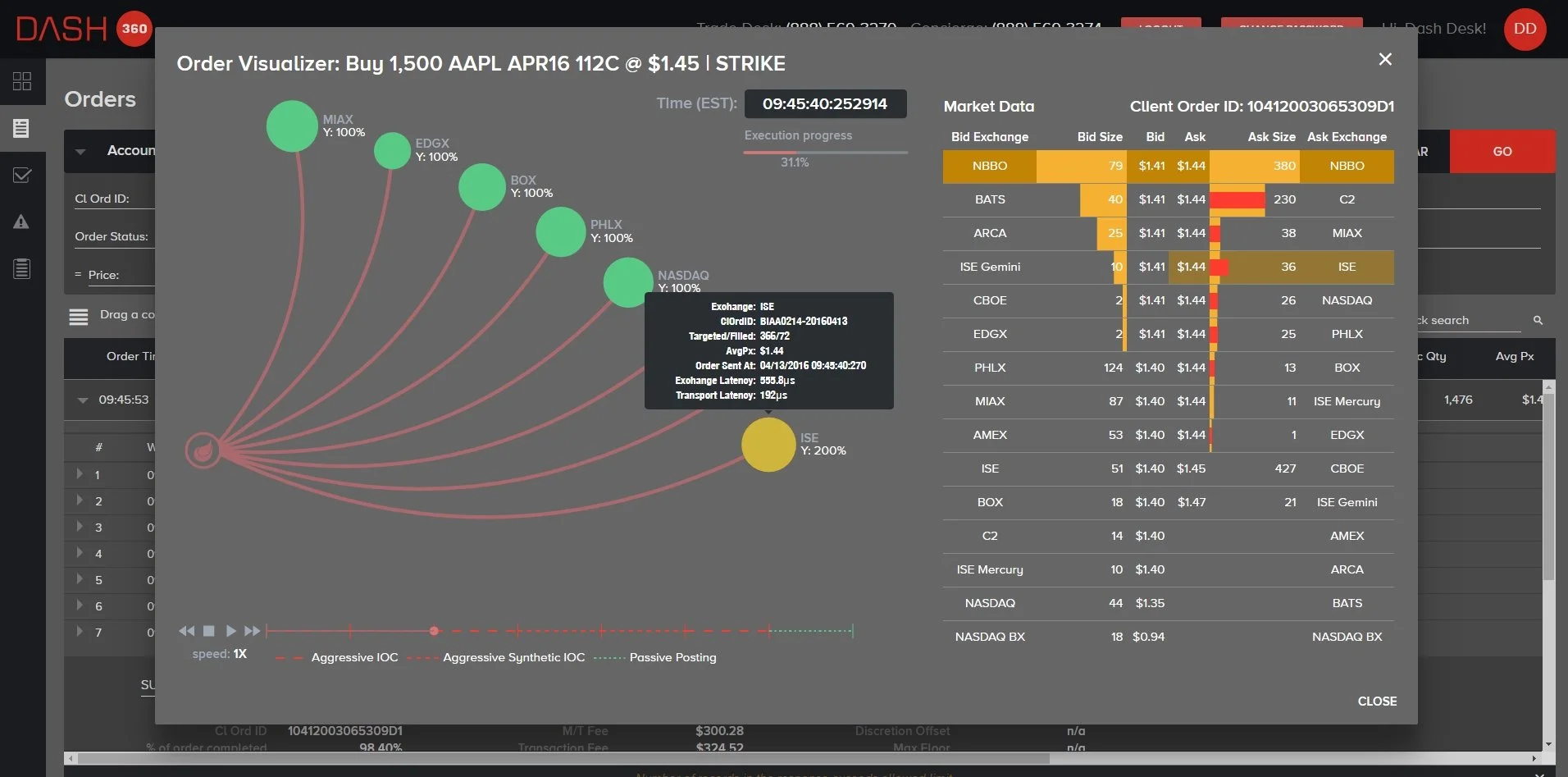
DASH360® Order Visualizer
The Order Visualizer is the flagship feature of DASH360. It shows a single order being executed in real time across multiple exchanges. The visualization uses an animated flow diagram: the order enters from the left, and you can see it being routed to different exchanges like NASDAQ, NYSE, BATS, and ARCA. Each route shows the volume, timing, and fill status. Before this existed, with the legacy product, traders had to read raw execution reports; rows and columns of numbers. The visualizer lets them see the execution story at a glance: Was the order filled quickly? Was it spread across many venues or concentrated? Were there rejections? I explored several alternatives: a timeline view, a diagram, and a simple stacked bar chart. Through testing with traders, the flow visualization won because it maps to their mental model of how orders move through the market. They literally think about orders ‘flowing’ to exchanges. Matching the visual metaphor to the mental model made it instantly intuitive.
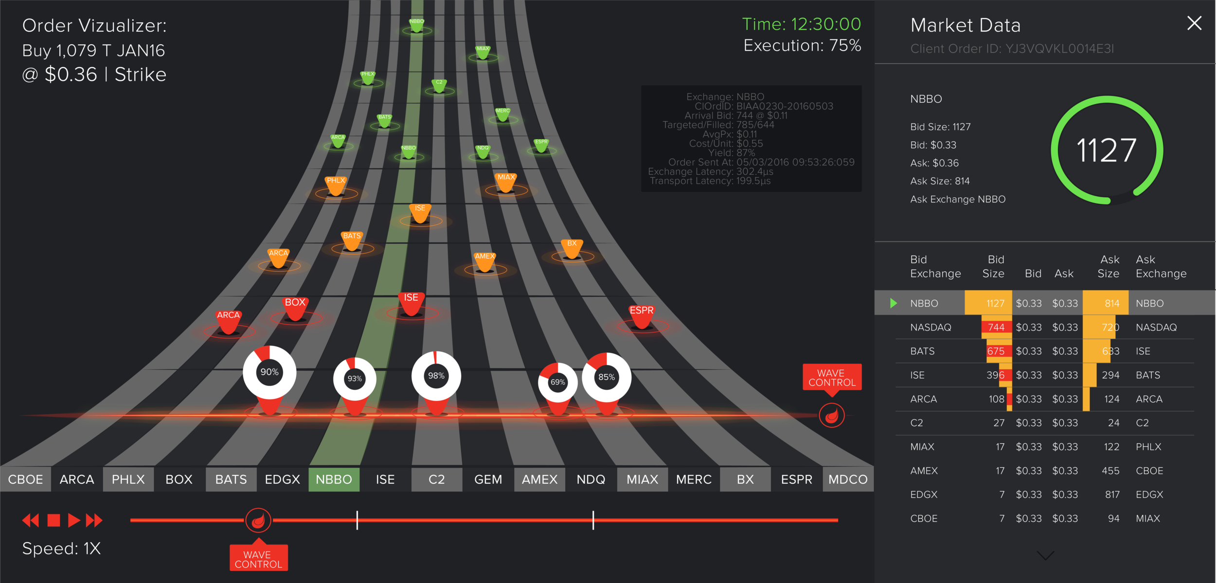
DASH360® Order Visualizer 3-D
“When I observed traders, I noticed they’d glance at their screens every few seconds during active trading. That meant every visualization needed to be readable in under a few seconds; that constraint drove the entire visual hierarchy.”

DASH360® Widget Selector
DASH360’s dashboard has 11 widget types: fees, product summary, price improvement, venue breakdown, lit-versus-dark, yield, aggressive-versus-passive, wave distribution, value, heat treemap, and liquidity improvement. That’s an enormous amount of information. I solved this in three ways. First, I made the dashboard modular and customizable; traders can add the widgets they care about via the selector panel, so they’re not overwhelmed by widgets they don’t use. Second, I designed each widget to be self-contained with a clear title, one primary visualization, and one or two key numbers. Third, I established a visual hierarchy where the most actionable information is always in the largest type or the strongest color contrast. The principle was: each widget should answer one question in under a few seconds.
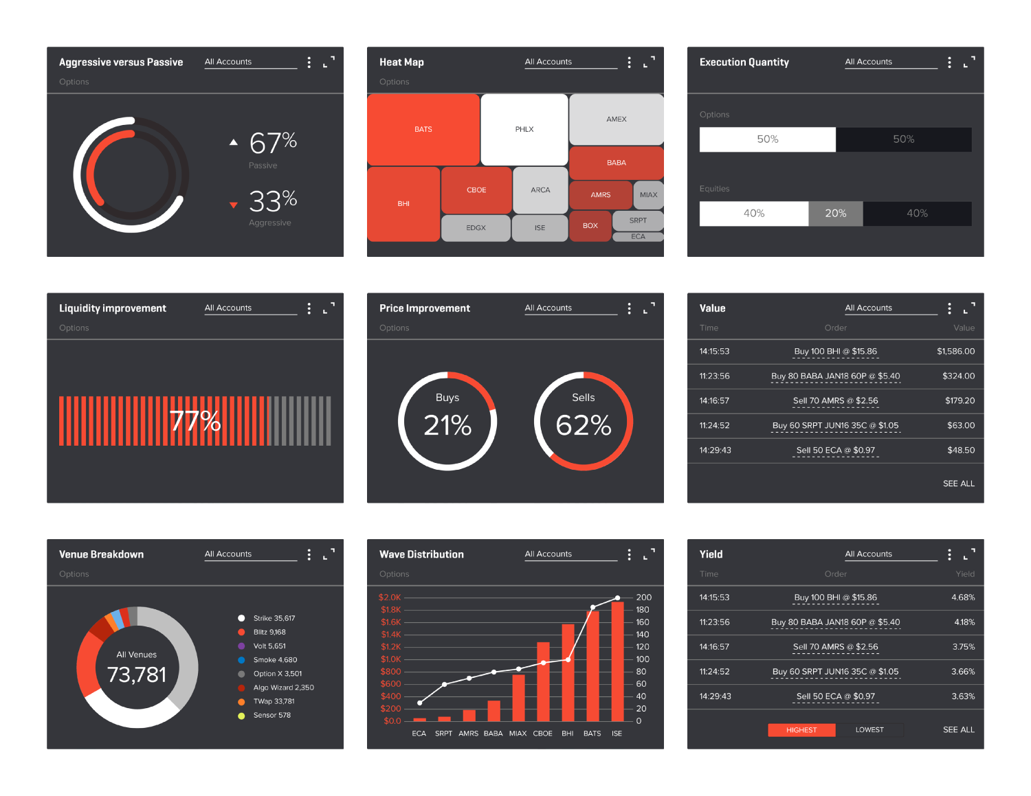
DASH360® Widgets
PUBLIC ONLINE WEBSITE & OVERVIEW PAGE
Designed the public website and its overview page for helping potential customers find the information.

DASH360® Public Website Homepage
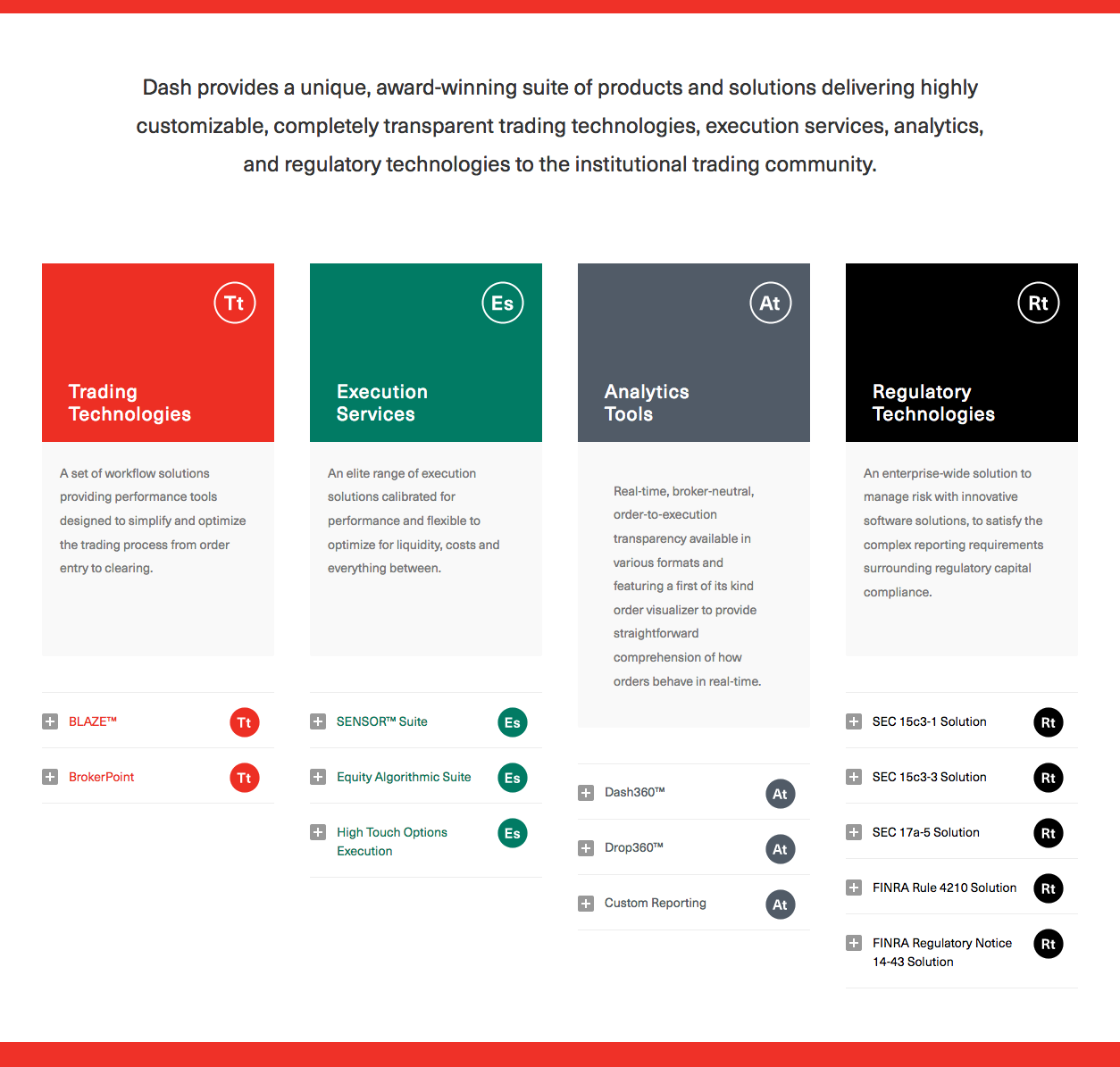
DASH360® Public Website Product Overview
OUTCOMES & IMPACT
Market Launch: DASH360 launched successfully as a web-based analytics platform used by institutional traders executing high-frequency algorithmic trading options orders across multiple exchanges in real time.
Scope: Designed the complete DASH360 experience; a customizable analytics dashboard built around 11 distinct visualization widgets (fees, product summary, price improvement, venue breakdown, lit-versus-dark, yield, aggressive-versus-passive, wave distribution, value, heat treemap, and liquidity improvement). Traders could assemble their own dashboard views based on the execution metrics they tracked most closely.
Design System: Defined the full dark-themed design system including typography, color, data visualization palette, button states, table structures, and widget components. The system was built for readability at typical trading-desk viewing distances and across multi-monitor setups, where eye fatigue and scannability are functional requirements, not aesthetic choices.
Flagship Feature: Designed the Order Visualizer; a real-time flow diagram that shows a single order being routed and executed across exchanges. This visualization replaced the previous workflow of reading raw execution reports row by row, giving traders an at-a-glance view of execution quality, fill timing, and venue distribution.
Public Presence: Also designed the public DASH Financial Technologies website and product overview pages, extending the DASH360 visual language into the company’s marketing and sales touch-points.