Case Study 1: Bank of New York
CASE STUDY 1: BANK OF NEW YORK
My Role & Contribution: Product Designer — Led end-to-end design for the NetX360 platform across web and mobile. Key areas included the dashboard, trading flows, account balances, and an AI chatbot.

OVERVIEW
NetX360® is a web-based wealth management platform for financial services and a single point of access for professionals to manage their business and support their clients by focusing on data and analytics.
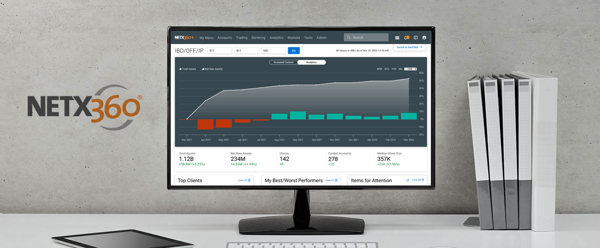
NetX360 Dashboard & Chat-Bot
THE PROBLEM & THE BUSINESS GOAL
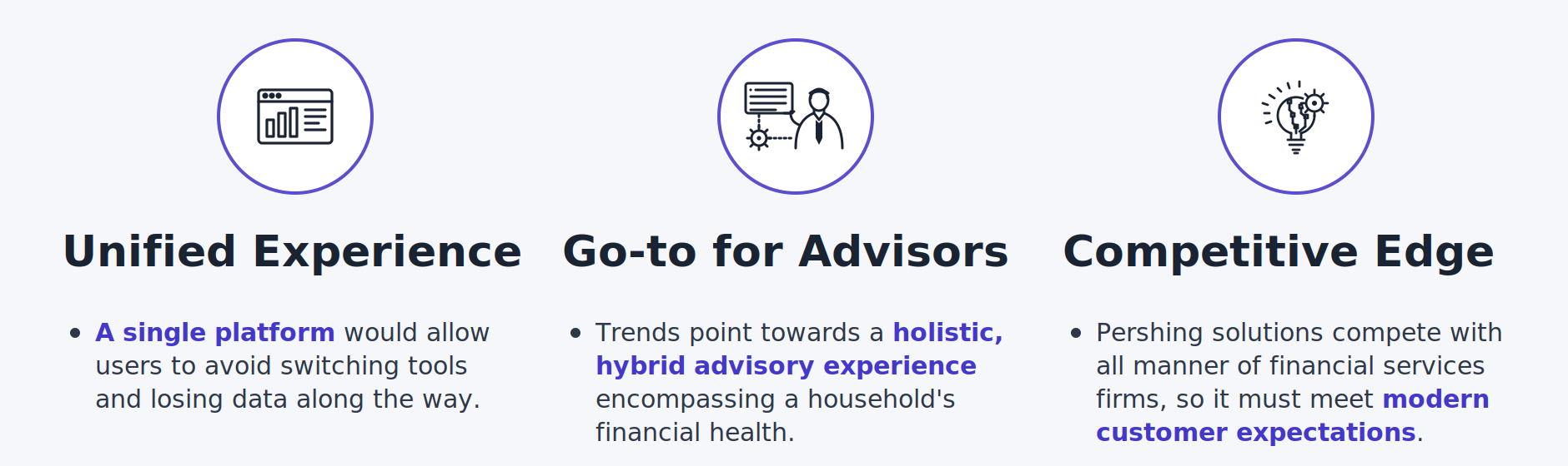
Even with the explosion of FinTech solutions over the past 10 years, advisors still have to piece together a platform to serve their clients. The goal is to reimagine their advisory platform so that it delivers a unified user experience.
“Financial advisors were using a fragmented platform — they had to piece together tools across multiple application screens to serve clients. I was brought in to reimagine the core experience into a unified platform that lets advisors see everything they need in one place.”
DESIGN PROCESS
UNDERSTAND THE USERS & EMPATHY WITH THE USERS
Following an initial research phase, the bulk of work involved short and efficient iterations on a prototype. Talked to stakeholders to understand the users: researched who they are, how they work, what are the needs and why and how they use.
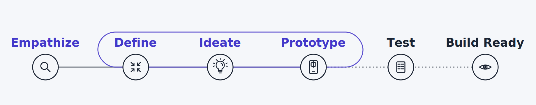
IDENTIFY THE PROBLEMS & DEFINE THE USER’S PAIN POINTS
I focused on the user needs for a simple solution that allows a user to more directly see an overview of numbers and information:
UX Strategy: Focus on providing the users a quick overview, reducing the time spent searching across multiple pages.
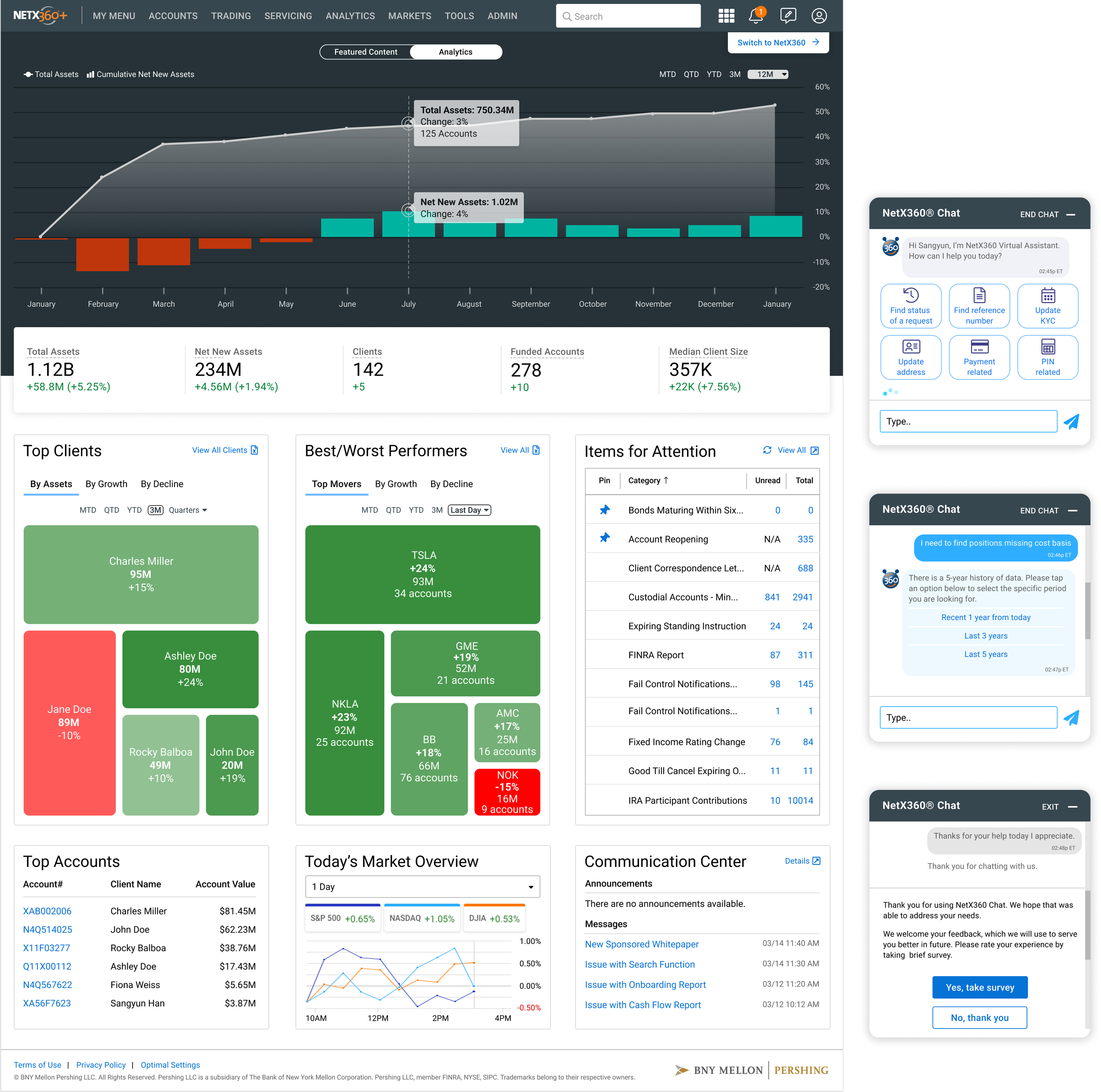
UI Element: Users need a dashboard with a stat bar, content tiles, and data visualizations.
There is a growing need for a simple solution that allows a user to more directly see an overview of numbers and information by using a stat bar and content tiles on the dashboard. Also, in order to display the information, the data visualization is recognized as an important feature to be included in the dashboard. Therefore, the users can see the quick overview and minimize the time to spend searching for the pieces on each different page.
USER PERSONA, USER STORY & SCENARIO
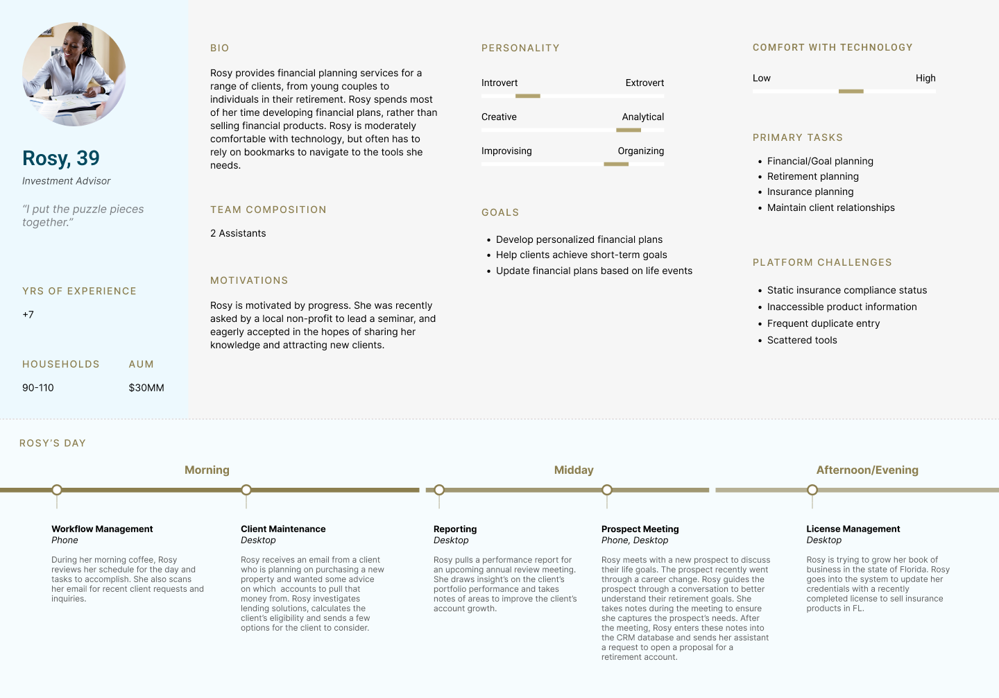
Conducted multiple stakeholder interviews and translated research findings into user persona and user scenario. Focused on the 3 types of users. 1. Principal Advisor who needs the end-to-end journey, 2. Portfolio Manager who needs the trading journey, 3. Investment Advisor who needs the planning/lending journey.
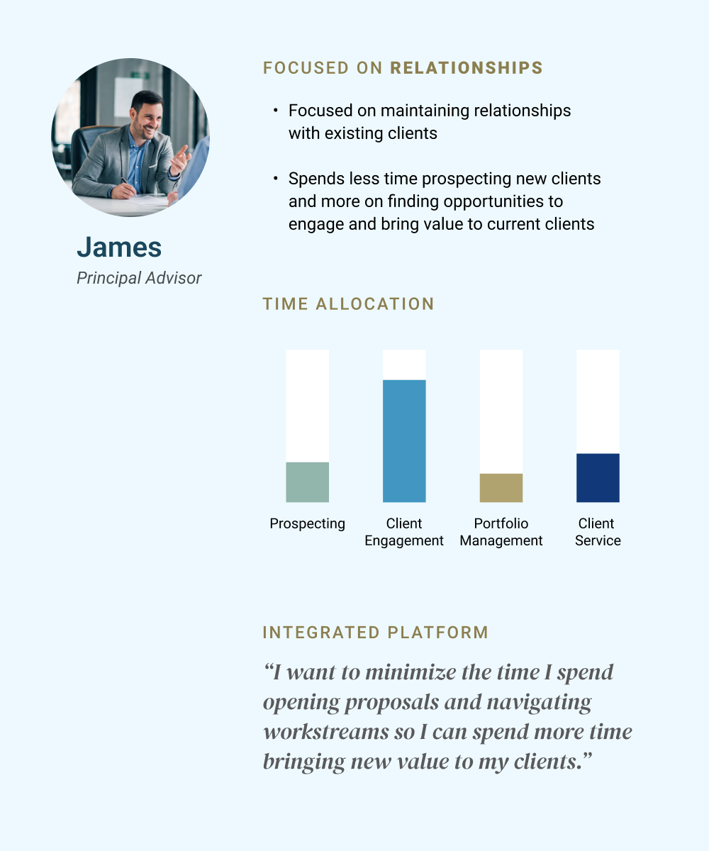
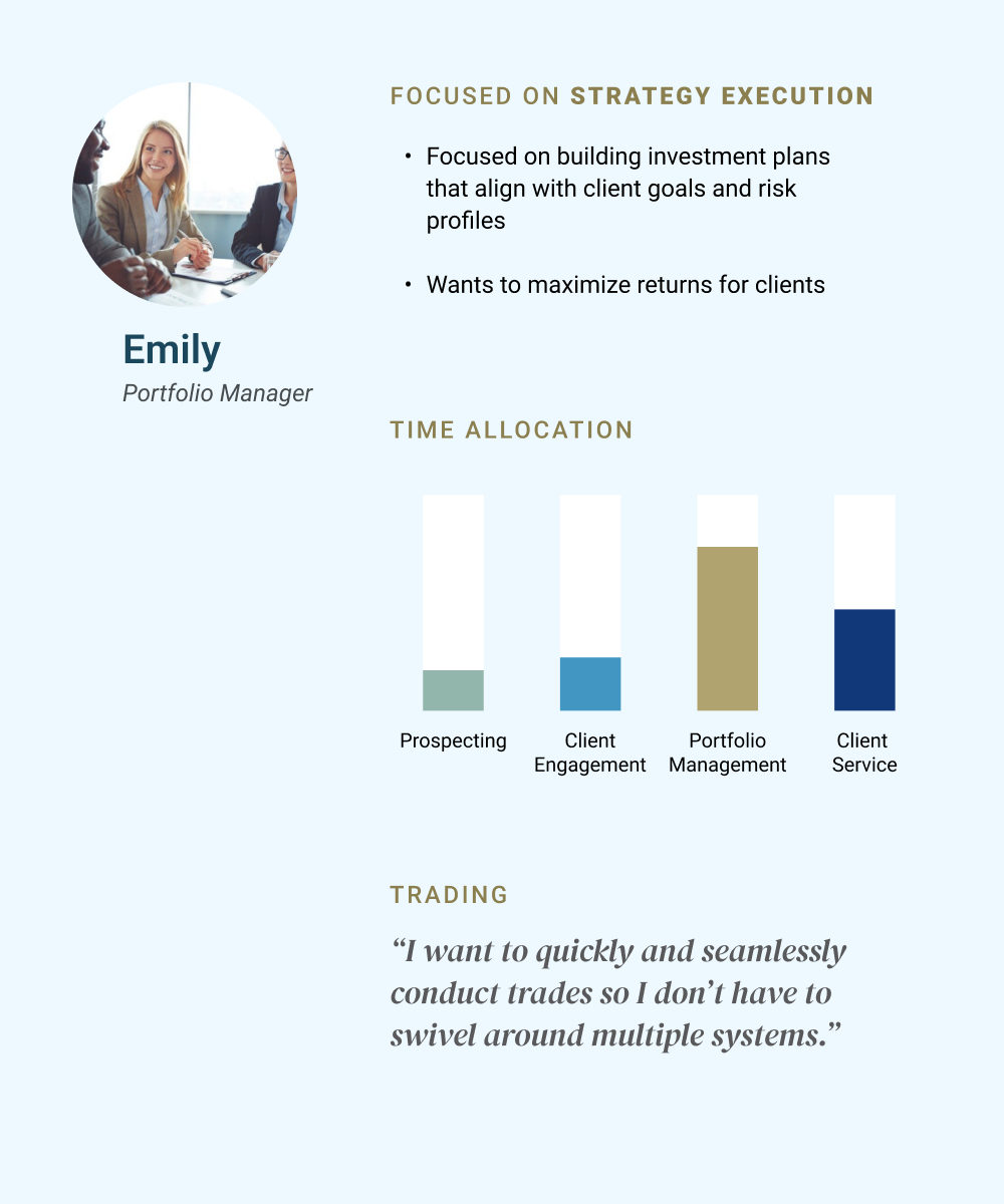
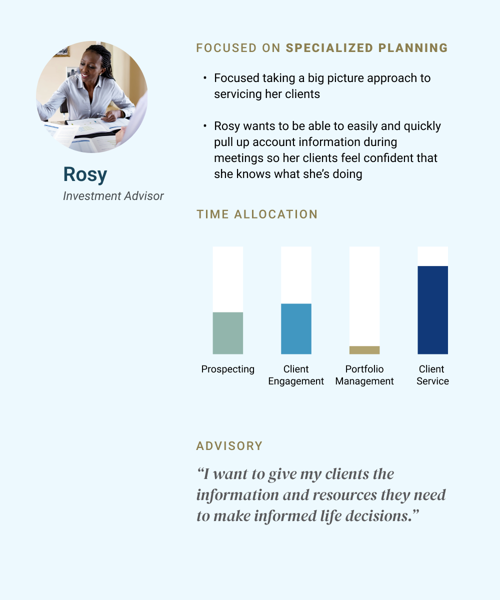
I started by interviewing stakeholders to understand the financial advisors’ daily workflows and identified three distinct personas
“James needed a quick overview of his 100+ households at a glance — that’s what drove the treemap view on the dashboard. Emily needed fast access to trading — that’s why the trade button is directly placed on the holdings page for mobile.”
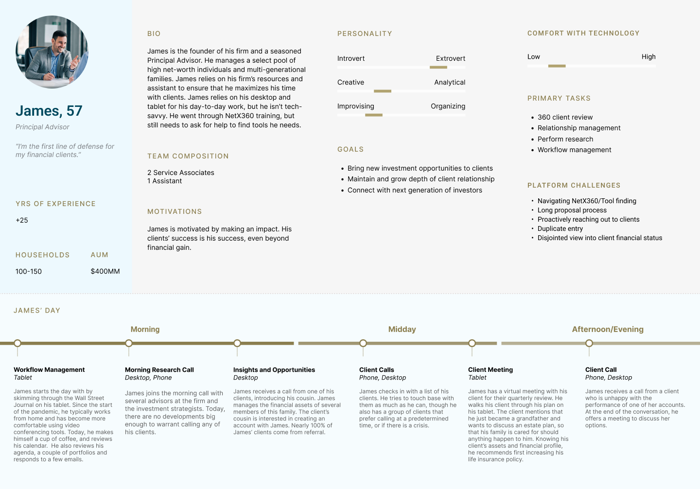
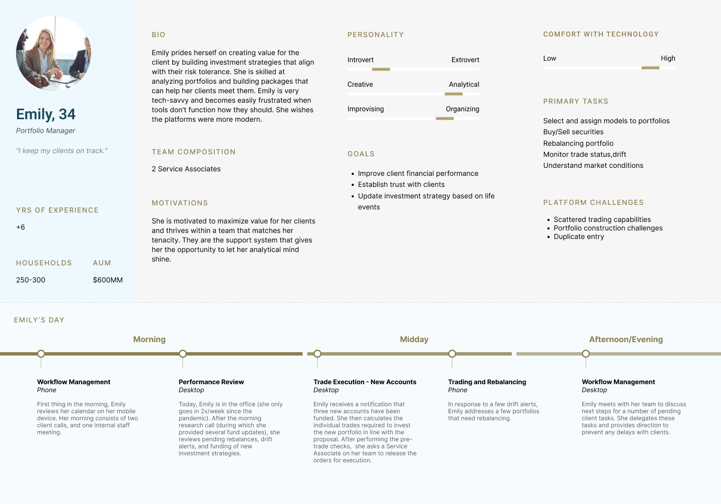
Conducting the interviews created the insight that shaped the entire dashboard design: instead of one static view, I designed a modular dashboard with content tiles that could surface the most relevant information for each workflow. The stat bar at the top gives every advisor an instant read on their key numbers — total assets, net new assets, client count, funded accounts, median client size — so they never have to hunt for the basics.
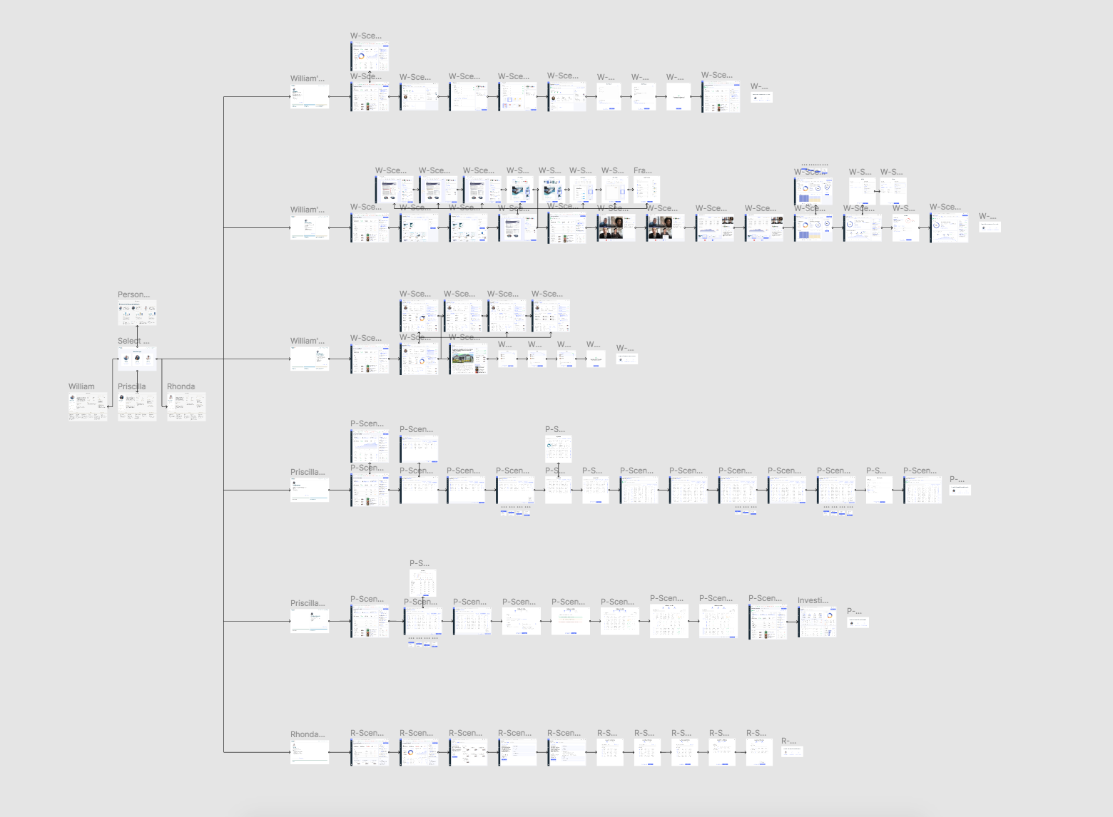
HIGH-LEVEL USER FLOW MAPPING
Mapped out the holistic user flows at a high level and figured out how those pages and features work together to impact the overall experience. Created wireframes to see the overview and to iterate the design for each screen. Generated multiple different layout designs, navigation and information hierarchy to identify the best practice.

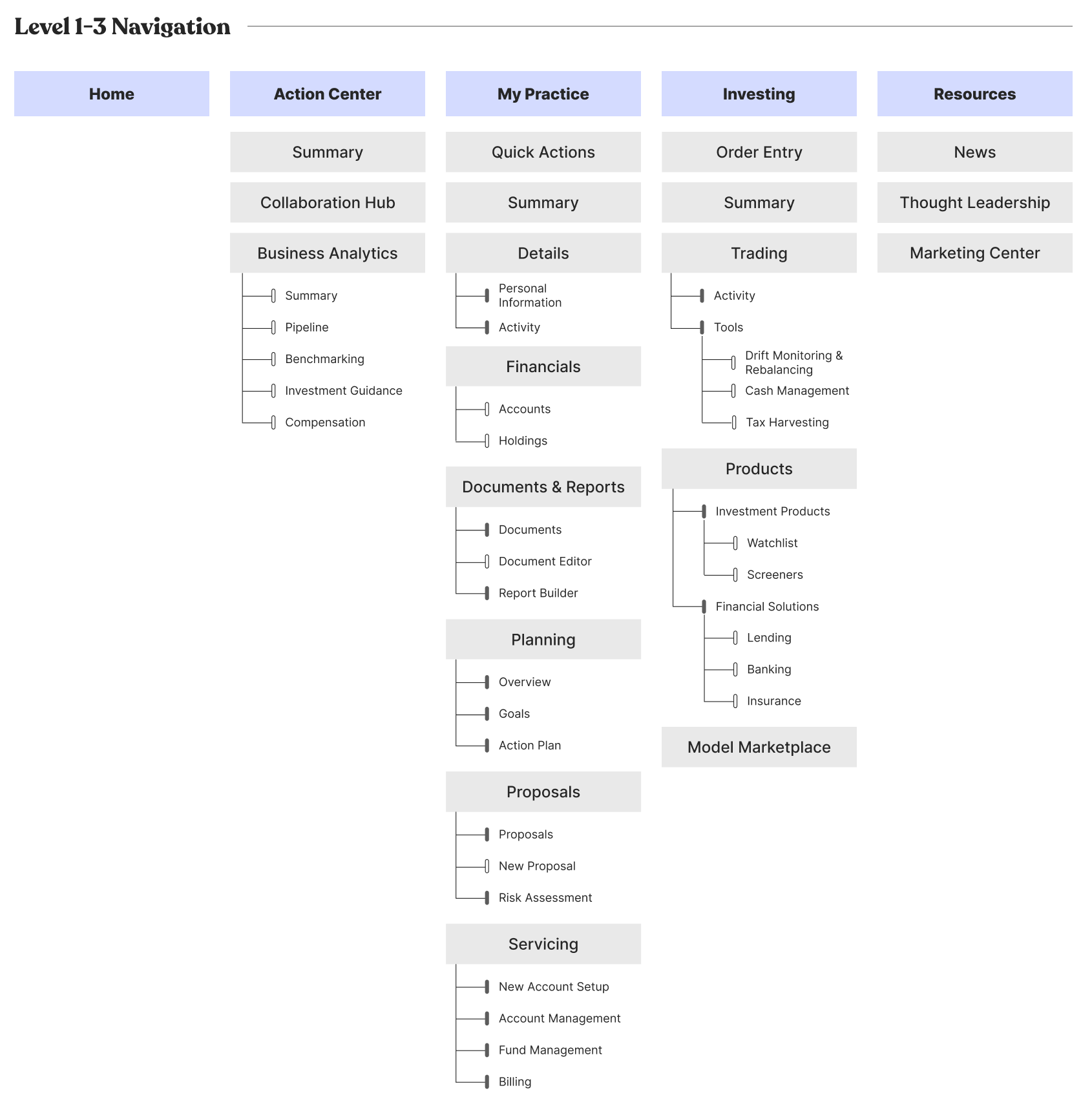
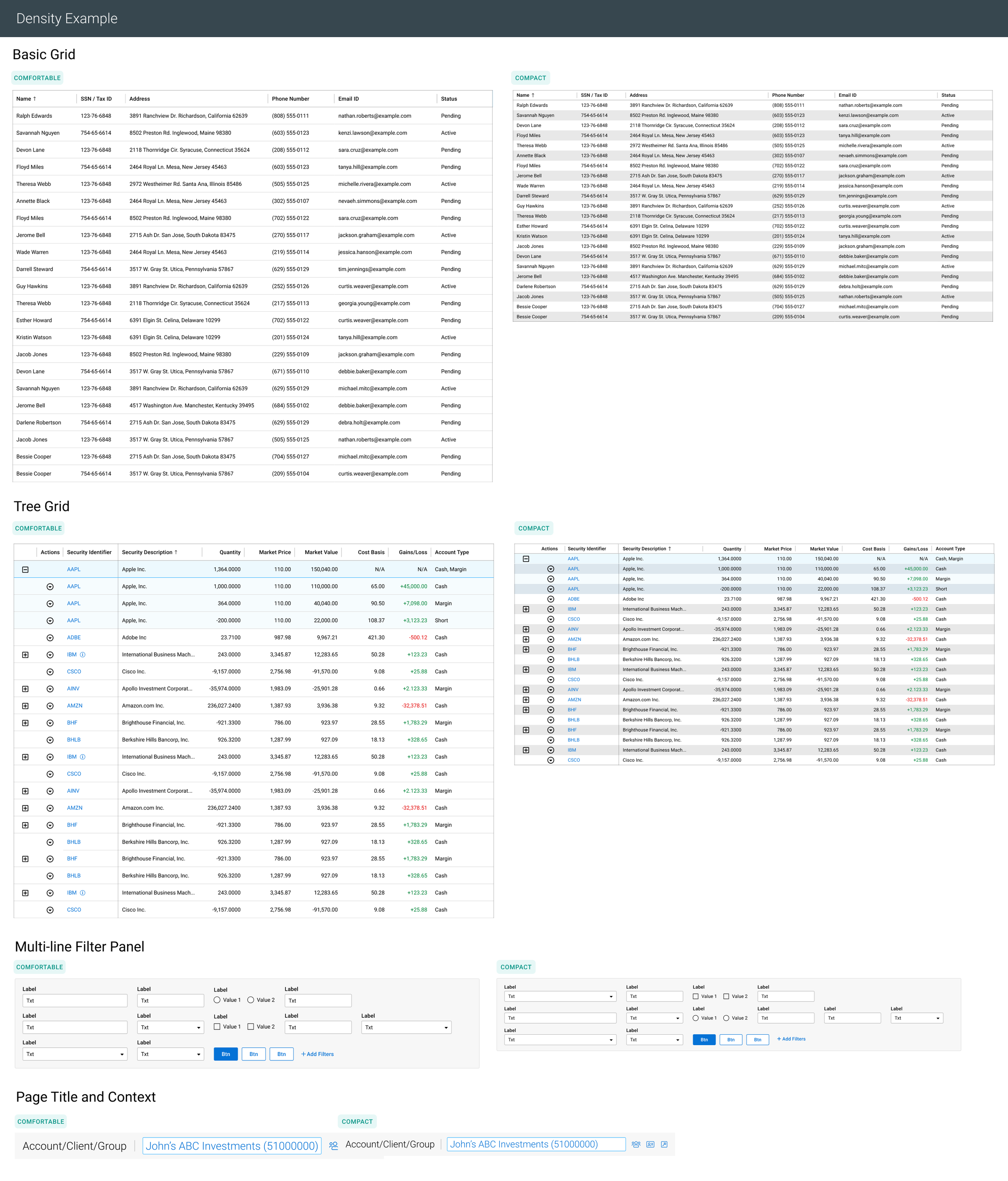
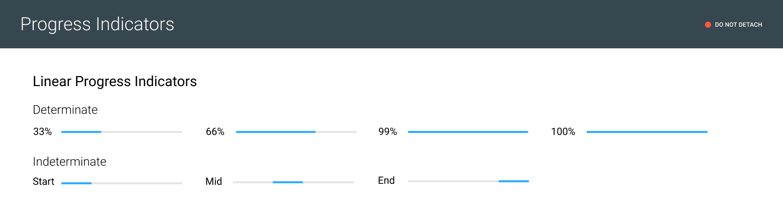
DESIGN SYSTEM & UI STYLE GUIDELINE
Challenge: When I joined the project, the legacy products didn’t have a unified design system, causing inconsistencies in UI and UX behavior.
UX Strategy: I audited the platform, then collaborated with engineering to build a shared component library.
UI Element: I built the primary, secondary, data viz palettes, navigation, grids, tables, filters, and modals.
Impact: This "single source of truth" ensured visual consistency and reduced design-to-dev handoff time.
Designed, built, set and applied typography and color scheme to all pages and delivered the consistent visual language. Rebuilt the design system using Figma & Zeroheight in order to provide UX patterns and UI style guidelines for developer’s side to be used as a reference.
When I joined the project, there was no unified design system — different parts of the legacy version NetX360 had been built by different teams over the past years, resulting in inconsistent typography, colors, component behavior, and spacing. My first step was auditing the existing platform to catalog every unique button style, table variant, icon treatment, and color. I found significant inconsistency. With the engineering team collaboration, I worked to establish a shared component library in Figma and published the documentation on Zeroheight so that both designers and developers had a single source of truth.
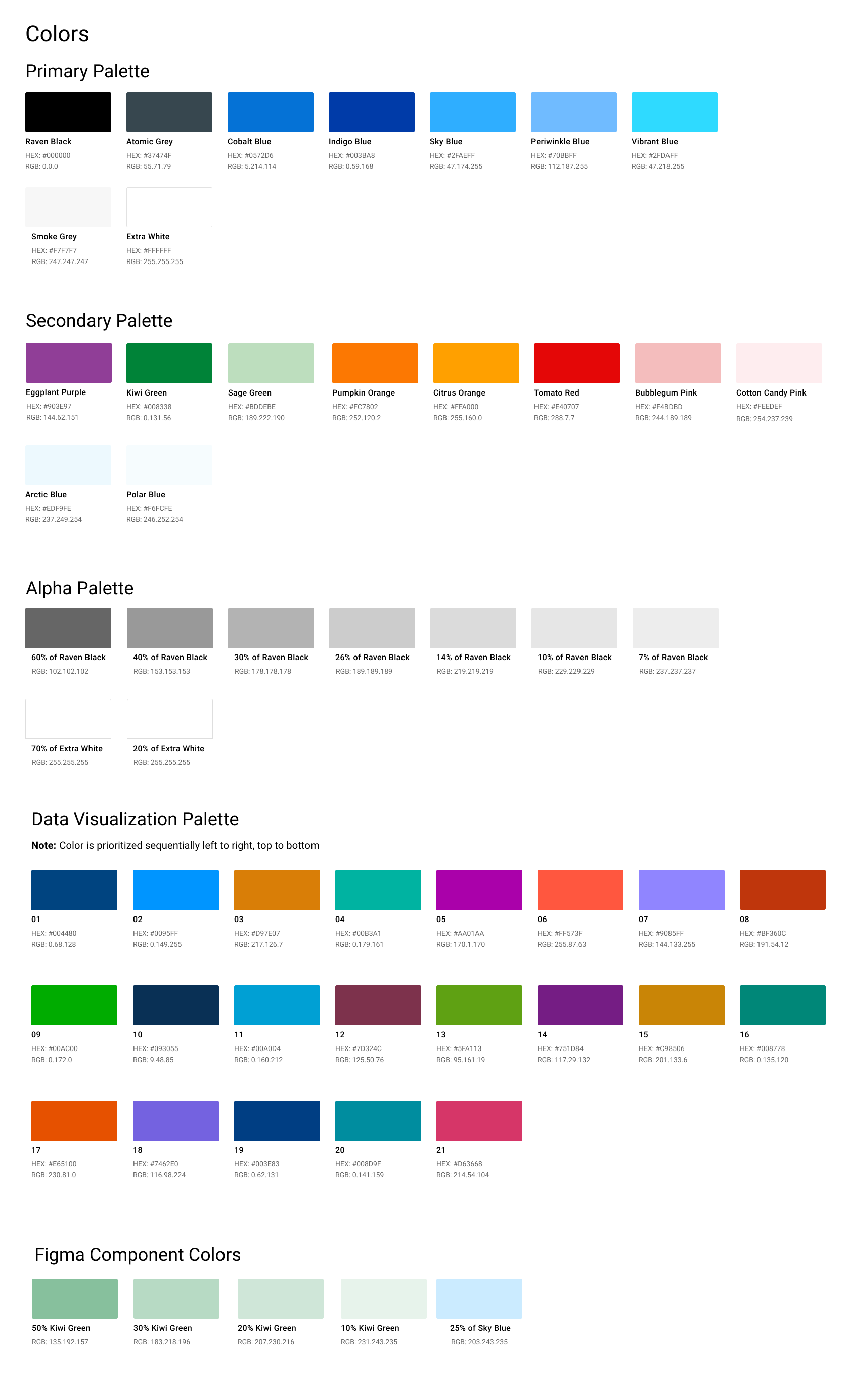
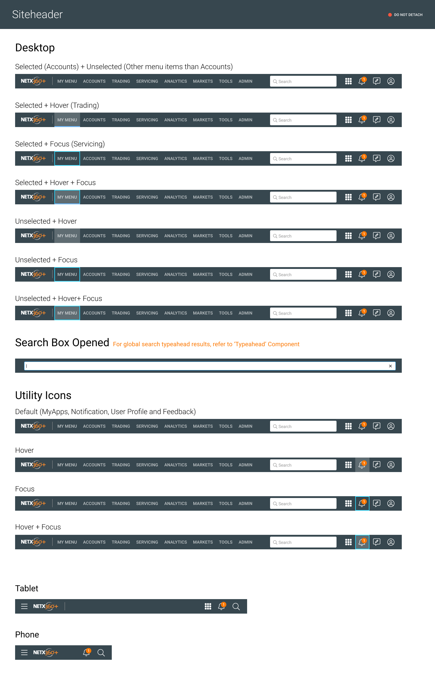
The system includes the primary and secondary color palettes, a dedicated data visualization palette with 21 sequential colors, responsive navigation patterns for desktop, tablet, and phone, and a component library covering grids, data tables, filters, progress indicators, and modals.
The biggest impact was on development velocity — once engineers could reference Zeroheight instead of redlining every screen, the design-to-dev handoff time dropped nicely. It also meant new features launched with visual consistency automatically.
HIGH-FIDELITY PROTOTYPE ➝ TESTING ➝ ITERATION CYCLE ➝ MARKET LAUNCH
I designed low-fidelity wireframes, high-fidelity mockups and clickable Figma prototypes.
UX Strategy: I refined them through iterative usability testing to validate user behavior and pain points.
UI Element: I designed the dashboard with a modular system, and data visualization widgets on sub pages.
Impact: This feedback-driven process led to the successful launch of the new NetX360 platform.
Designed, built high-fidelity mock-up screens, converted the wireframes and visual design concepts into clickable prototypes with Figma app. Conducted usability testings with multiple concept iterations to observe how they use, what they think, and to validate what things work, what things do not work. Applied that feedback collected from usability testings to the design and iterated the mockups multiple times. Its production version of the new NetX360 platform launched successfully.
“After launch, advisors told us they could now get a full client overview in 30 seconds instead of navigating 4 separate application screens.”

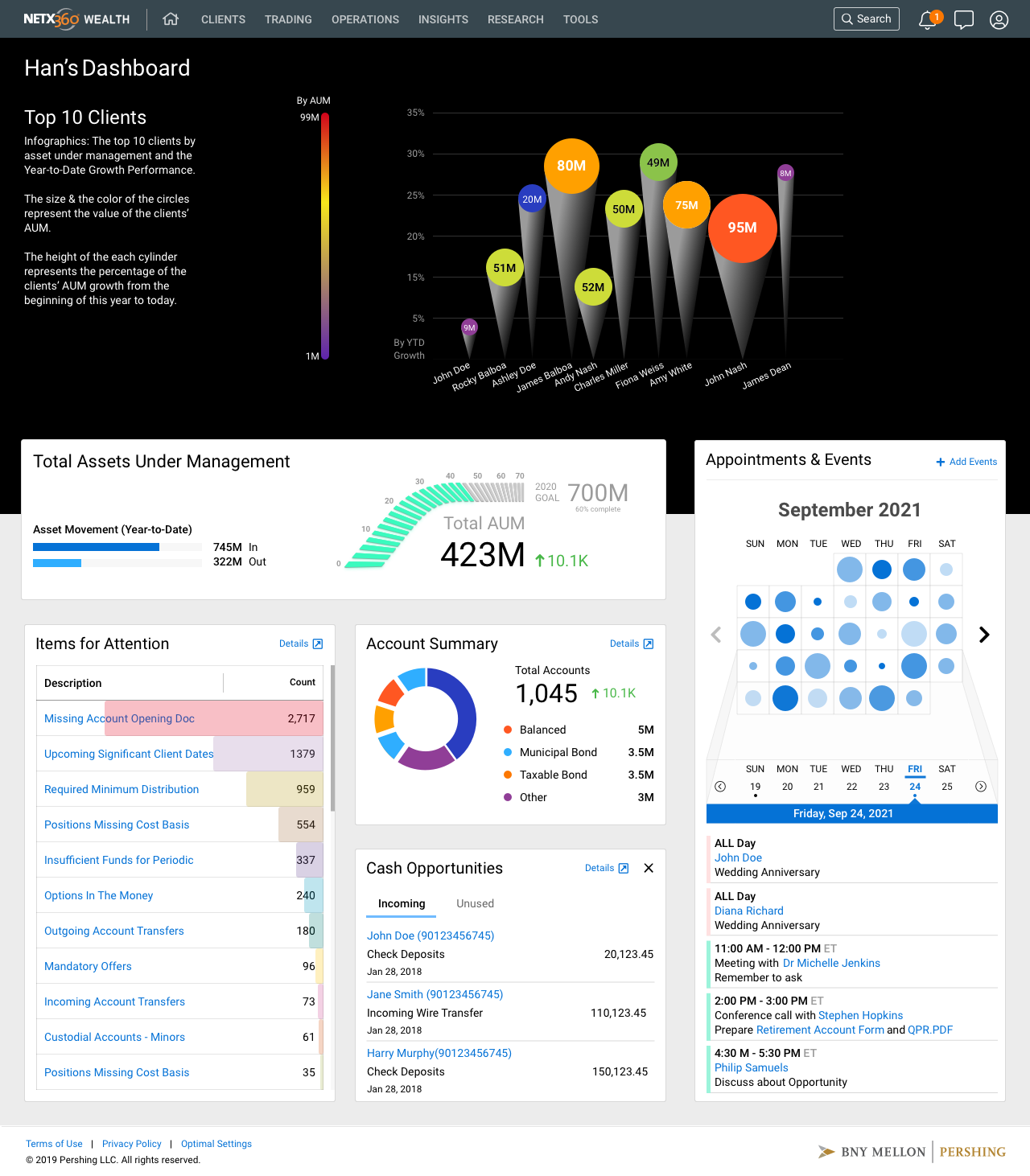
NetX360® Top Clients Portlet
Challenge: Stakeholder & user conflicting opinions between visual pattern recognition and functional data accuracy.
UX Strategy:
Dual-Mode Approach: Satisfying conflicting needs by providing the right tool for the task (visual vs. precise).
Data Hierarchy: Balancing at-a-glance overviews with deep-dive lookups to align user and business goals.
UI Element:
Toggle Switch: Swaps between visualization modes.
Treemap: AUM by size and performance by color.
List View: A table for granular data precision.
The Top Clients widget was one of the most debated design decisions. Advisors need to see their most important clients at a glance. A simple table would work functionally, but it treats every client the same visually. The treemap encodes two dimensions simultaneously: the size of each block represents the client’s AUM, and the color represents growth or decline. So James, the Principal Advisor persona, can glance at the dashboard and instantly see that his 2nd largest client is down 10%. During testing, I found that advisors loved the treemap for pattern recognition but wanted the table for precision lookups. So I placed a toggle button to switch between Treemap View and List View — you can see the icons in the top right of the widget. That dual-mode approach satisfied both the at-a-glance use case and the detail-oriented use case. This is a pattern I use often: when users are split on a design, the answer is usually not picking one side — it’s giving them the right mode for the right moment.
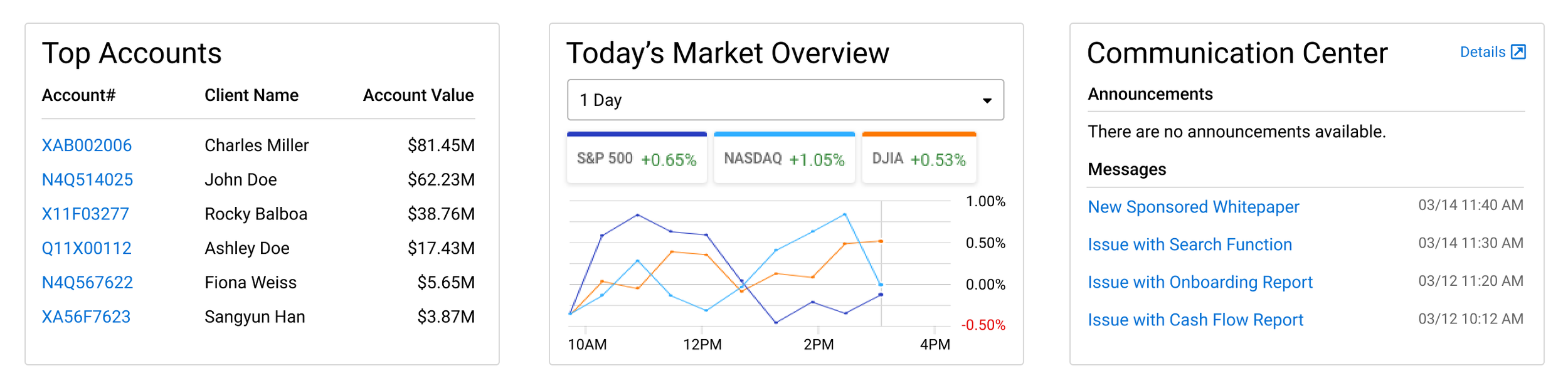
Challenge: Stakeholder conflicting opinions; Balancing business requirements for product visibility with the need to avoid intrusive advertisements that erode advisor trust.
UX Strategy:
Contextual Reframing: Shifting the goal from "promotional cross-selling" to "informational communication" to align with the user's workflow.
UI Element:
Communication Center: A dedicated dashboard panel that consolidates announcements and updates into a non-disruptive, integrated layout.
In a project at a major financial institution, there are many stakeholders — product managers, business analysts, compliance, engineering leads, and the advisory business line. Conflict of opinions may arise. The key to resolving such situations is to respect differing perspectives and identify their underlying causes. One specific example: the business team wanted to add a prominent cross-sell banner to the dashboard promoting new BNY products to advisors. I was concerned it would feel like an advertisement in the middle of their workflow tool and erode trust. The way I handled it: I didn’t just push back with my opinion. I went back to the user research and pulled specific quotes from advisor interviews about what they needed. I proposed an alternative: I added a Communication Center panel in the lower right of the dashboard that houses announcements, product updates, and messages in a format that feels informational rather than promotional. The business got their visibility channel, and advisors got a dashboard that remained focused on their clients. The stakeholders agreed to go with the alternative approach that I suggested. The key was reframing the request from ‘how do we promote products’ to ‘how do we communicate with advisors’ in their workflow without disrupting it.
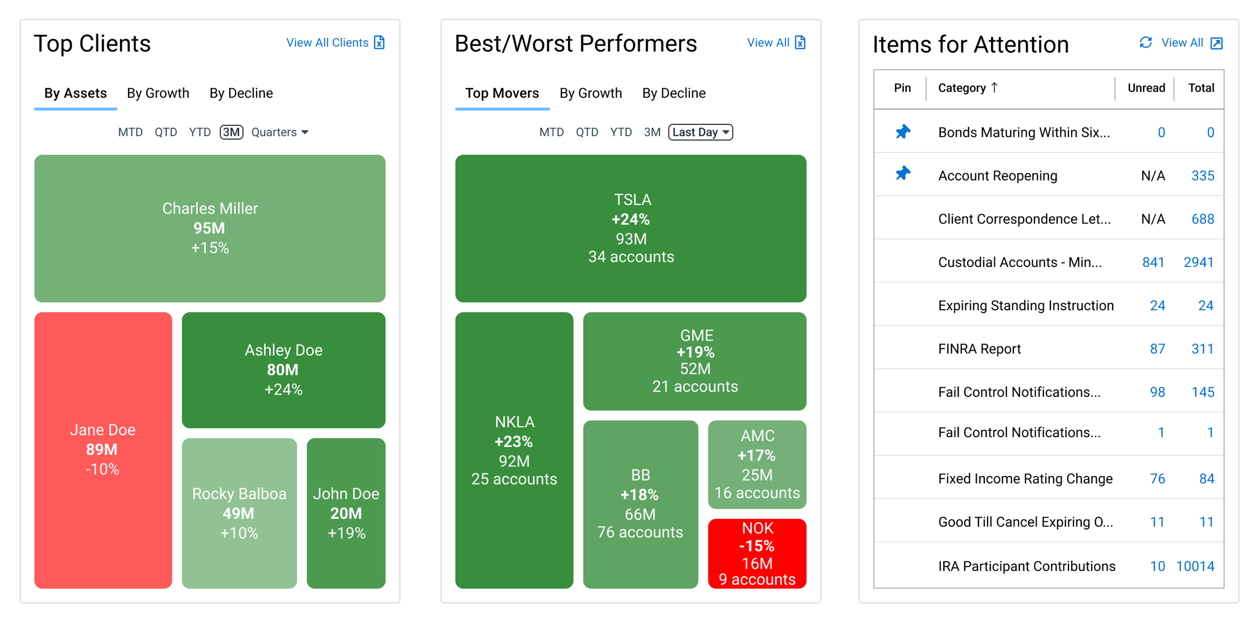
Challenge: Misaligned Hypothesis; Initial designs treated critical tasks as passive notifications rather than essential prioritization tools.
UX Strategy:
Adaptive Hierarchy: Elevating feature prominence based on real user behavior rather than initial assumptions.
Actionable Workflow: Transforming static alerts into an interactive "to-do list" to accelerate task execution.
UI Element:
Items for Attention Panel: A high-visibility widget featuring count badges, category sorting, and direct action links.
The most surprising insight from testing was about the ‘Items for Attention’ panel. I originally designed it as a simple notification list — things like bonds maturing, FINRA reports, account reopenings. During usability testing, the feedback told me this was actually more than the initial hypothesis. The feedback said: ‘This is my to-do list for the day.’ They were using it not just as alerts but as a workflow prioritization tool. Based on that feedback, I expanded it to include count badges, category sorting, and direct links to take action on each item. I also moved it from a smaller sidebar position to a more prominent placement. The lesson was that sometimes the users will find more value in a feature than I anticipated, and I need to be willing to elevate it based on real usage rather than my hypothesis about what matters most.

NetX360® Balances, Holdings screens for mobile devices
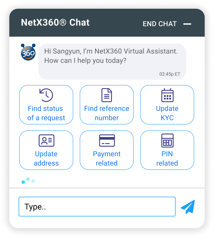
NetX360 Chat-Bot
“BNY Mellon Pershing’s legacy advisory platform served thousands of financial professionals, but it was fragmented — advisors were switching between disconnected tools to serve their clients. I was the product designer responsible for reimagining the homepage dashboard, workbook, holdings, and trading experience.”
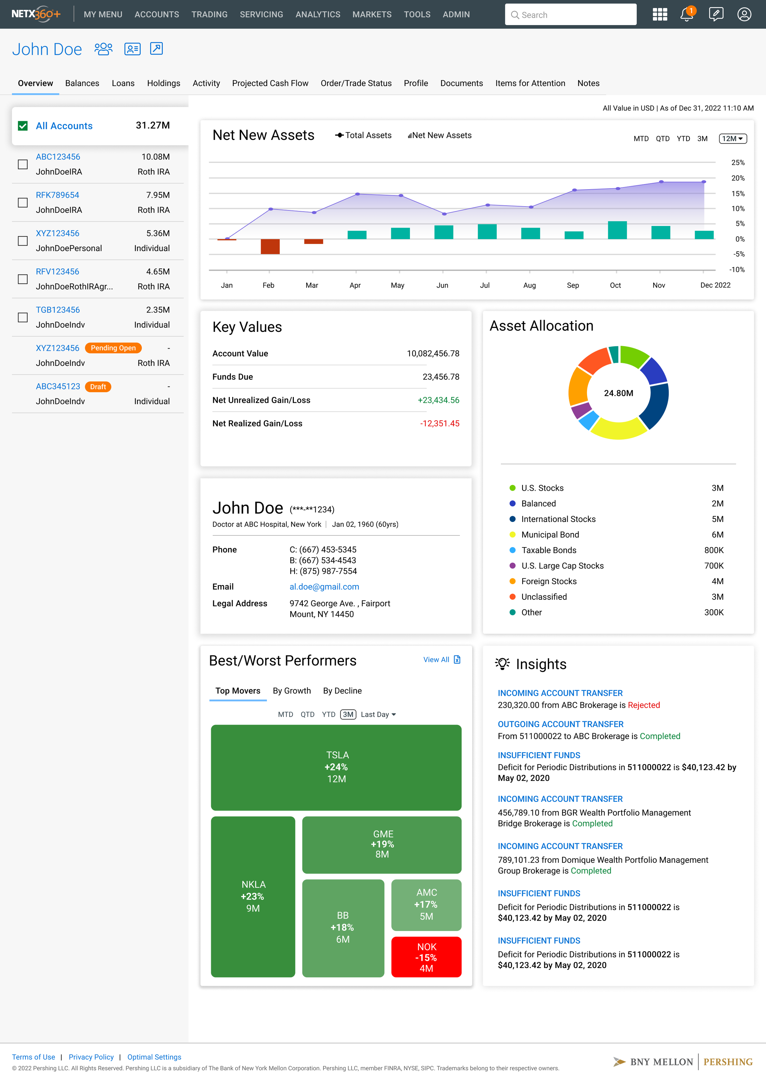
NetX360® Client Overview page
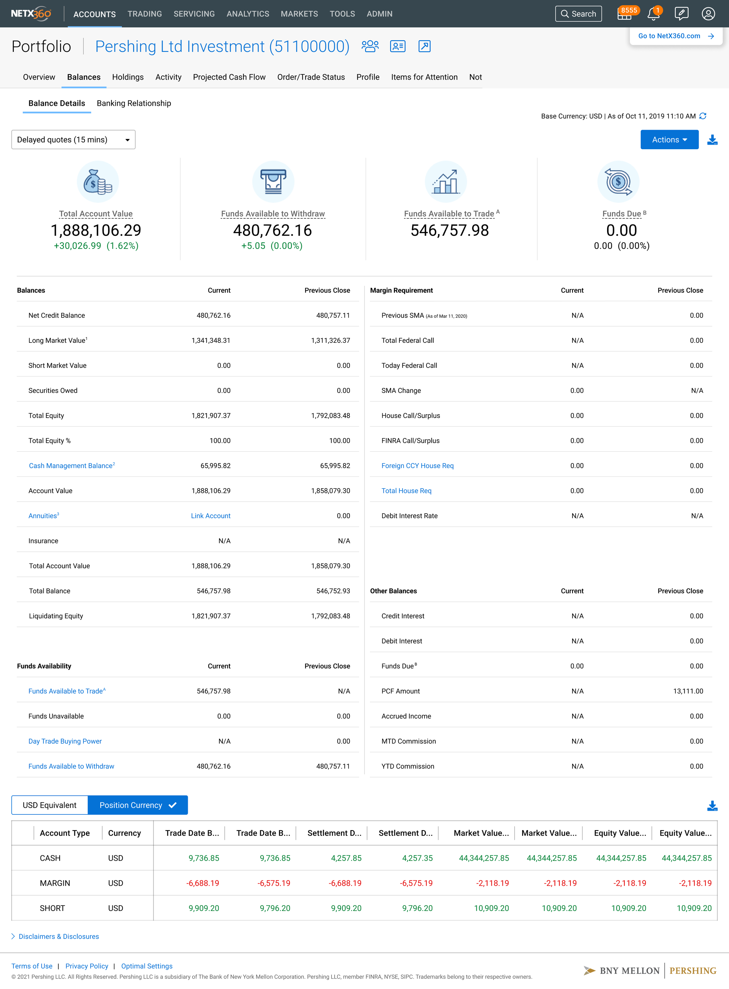
NetX360® Portfolio Overview Balances page
Challenge: Information Overload; Organizing complex financial data without cluttering the workspace or hiding critical information.
UX Strategy:
"Frequency × Urgency": Categorizing data by how often it is viewed and how quickly it requires action.
Progressive Disclosure: Moving non-urgent details to secondary pages to keep the dashboard focused on immediate tasks.
UI Element:
Anchor Widgets: High-visibility dashboard modules for instant monitoring and urgent alerts.
To decide what to put on the dashboard versus deeper pages in terms of information architecture, I used a framework I call ‘frequency times urgency.’ If advisors check something multiple times a day and it often requires immediate action, it belongs on the dashboard. If it’s important but not urgent, it belongs one click away. Through the research, I learned that advisors check their top client performance, net new assets, and items needing attention multiple times daily. So those became the three anchor widgets on the dashboard: Top Clients, Best/Worst Performers, and Items for Attention. Conversely, detailed account balances and holdings are important but are pulled up per-client, so they live on the account-level pages. The Today’s Market Overview widget was actually a late addition — during testing, advisors kept saying they wanted market context alongside their client data so they could connect market movements to portfolio changes without switching to the other application tools.
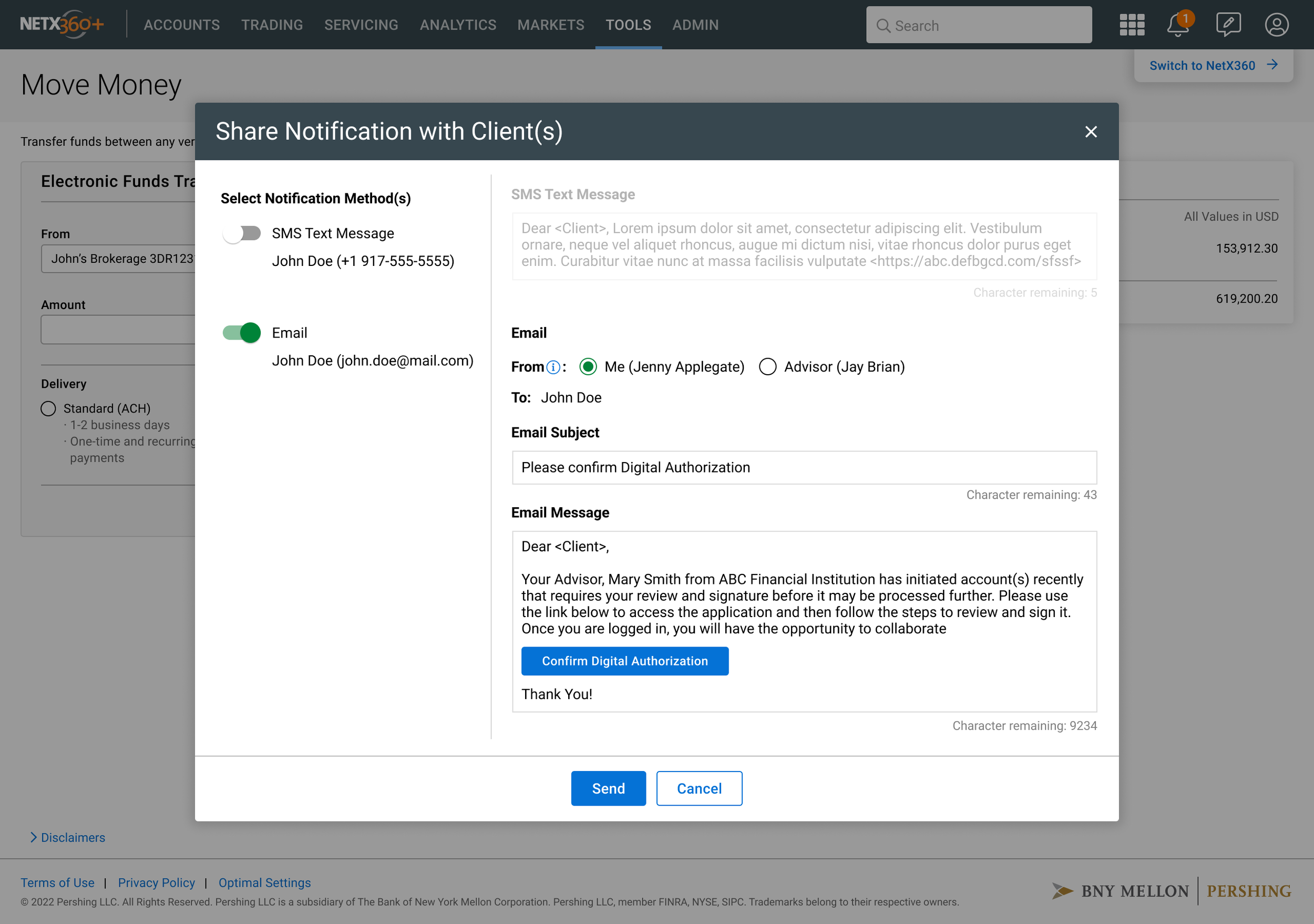
NetX360® Share Notification screen
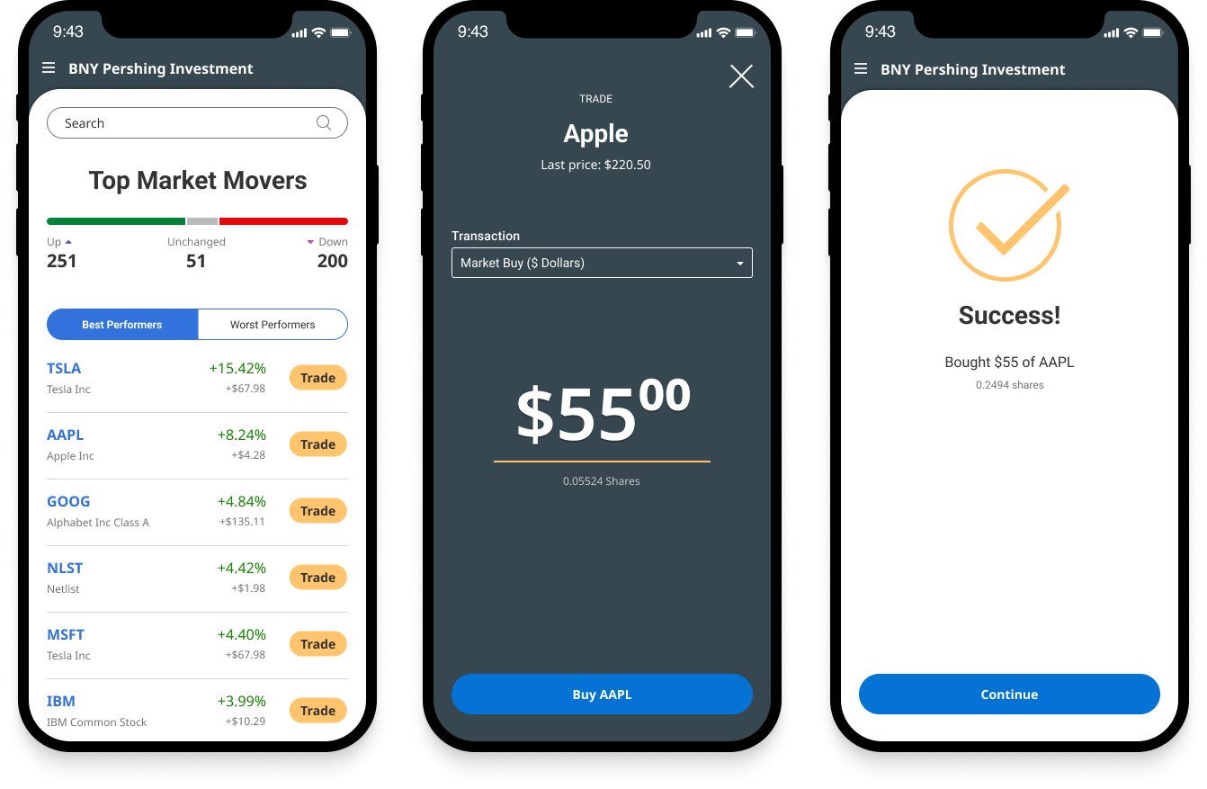
NetX360® Trading screens for mobile devices
The mobile trading flow distilled a complex desktop experience into a clean mobile interface while maintaining trader confidence.
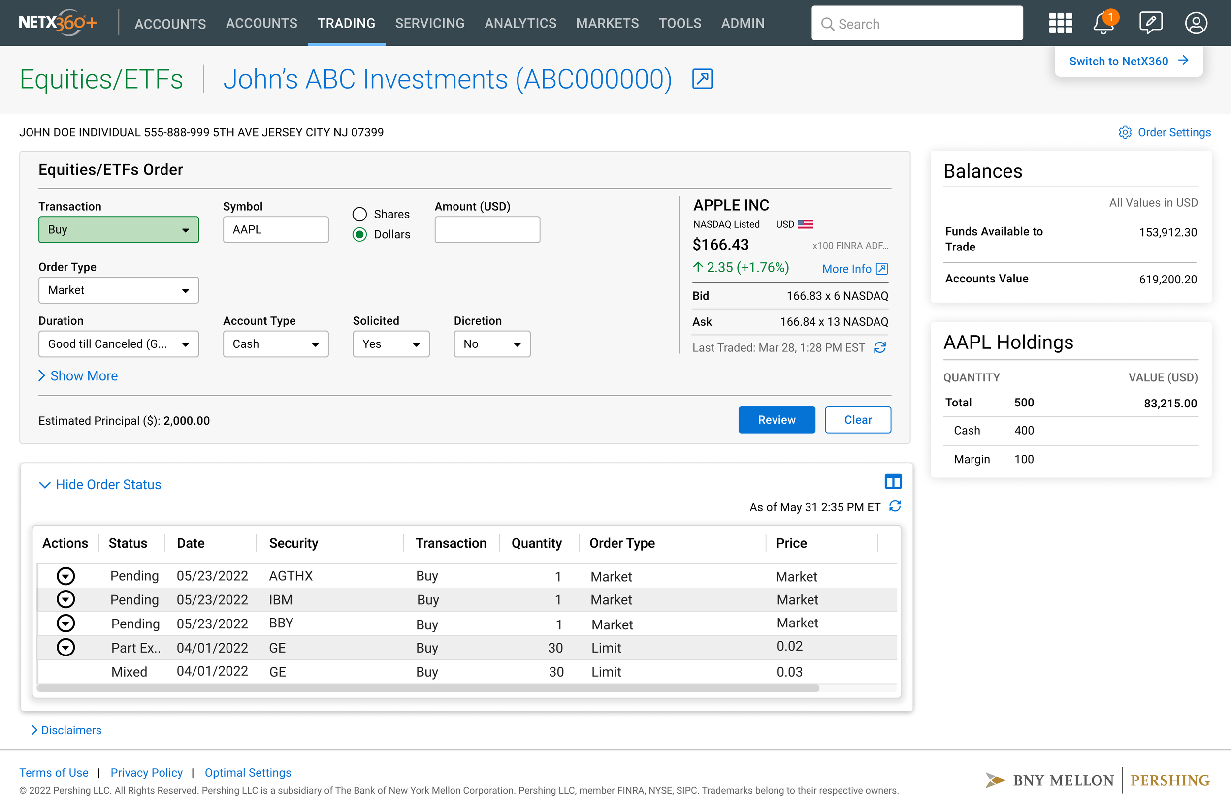
NetX360® Trading Order Entry screen for Equities/ETFs (Desktop Web Detailed View)
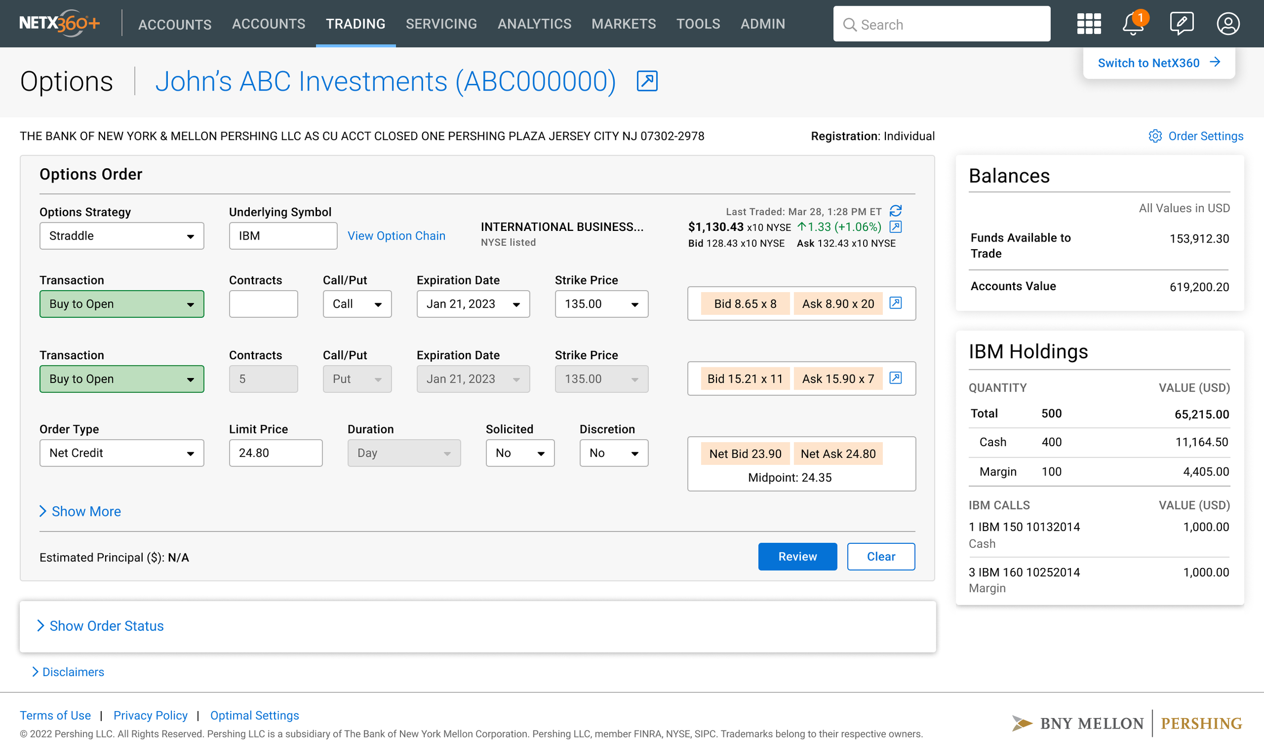
NetX360® Trading Order Entry screen for Options order (Desktop Web Detailed View)
Challenge: Complexity Scaling; Translating dense desktop trading screen interfaces into a mobile experience without sacrificing core functionality.
UX Strategy:
80/20 Optimization: Streamlining common reactive tasks while keeping advanced features accessible.
Cognitive Load Reduction: Using a tiered approach to ensure user confidence during high-stakes transactions.
UI Element:
Three-Step Order Flow: A guided process featuring a clear confirmation screen and an optional "Show More" expansion.
Trading on mobile was one of the biggest design challenges. On desktop, advisors have a full order entry form with dozens of fields. On mobile, that’s overwhelming. I started by observing what Emily, the Portfolio Manager persona, actually needed to do on mobile versus desktop. Mobile trading was mostly reactive — quite many times, she’d get an alert about market movement and need to execute a quick trade, not set up a complex multi-leg options strategy. So I designed the mobile trading flow around the most common transaction: a simple market buy or sell. The flow is three steps: select the security and see the current price, choose transaction type and enter the amount, then confirm and see the success state. I kept the full order form available through a ‘Show More’ expansion (optional setting), so power users aren’t blocked, but the default experience is streamlined for the 80% use case. The confirmation screen was critical — when moving real money, users need absolute clarity about what’s about to happen.
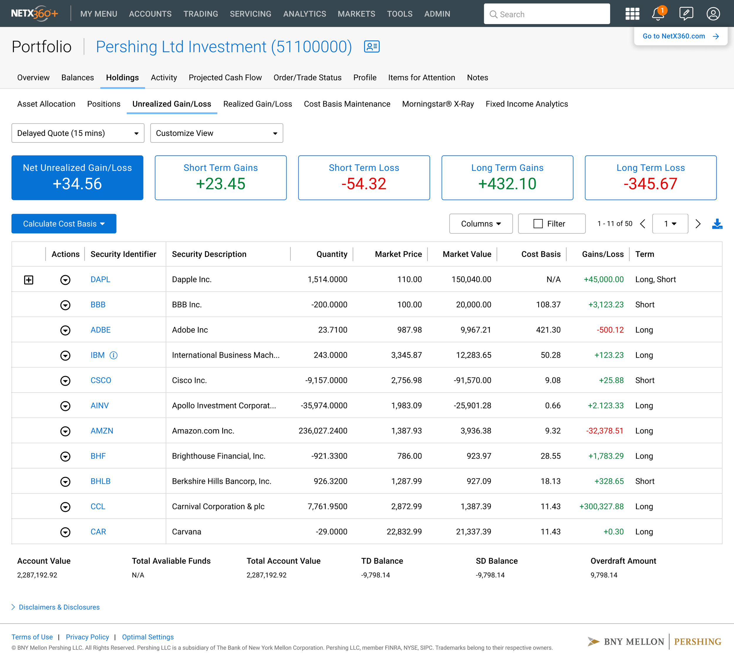
NetX360 Holdings page - Unrealized Gain/Loss
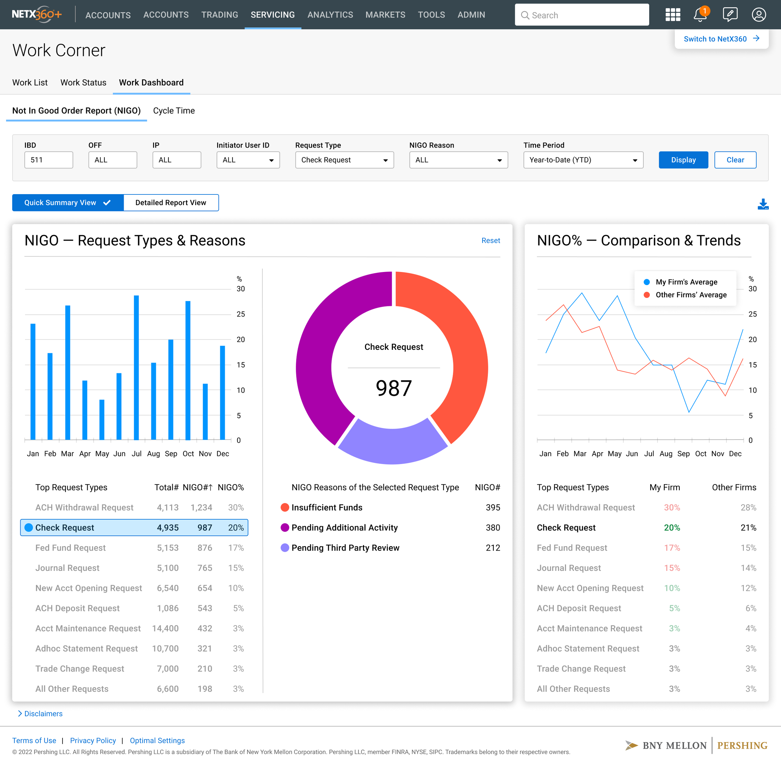
NetX360® Workbook Analytics NIGO report page

NetX360® Dashboard with Data Visualization
Data visualization for users with low vision: using a combination of colors, shapes & text to convey meaning, not only using colors.
Data visualization for users with low vision: using a combination of colors, shapes & text to convey meaning, not only using colors.

NetX360® Dashboard with Data Visualization
OUTCOMES & IMPACT
Market Launch: The redesigned NetX360 platform launched successfully to BNY Pershing’s financial advisor network, replacing the fragmented legacy experience with a unified, modular dashboard system.
Scope: Designed for thousands of financial professionals managing client portfolios across Pershing’s platform. Redesigned the homepage dashboard, workbook, balances, holdings, and trading pages for both desktop and mobile. 3 distinct personas — Principal Advisor, Portfolio Manager, and Investment Advisor — informed the design of workflows tailored to each user’s primary tasks.
Design System: Rebuilt the NetX360 design system from the ground up using Figma and Zeroheight, establishing a single source of truth for both design and engineering teams. The system included a primary and secondary color palette, a dedicated 21-color data visualization palette, responsive navigation patterns across desktop, tablet, and phone, and a full component library covering grids, tables, filters, progress indicators, modals, and site chrome.
User Feedback: During the testing sessions, advisors consistently highlighted the new dashboard’s ability to surface their full client book in a single view as a meaningful improvement over the previous interface. The treemap-to-list toggle on the Top Clients widget & the Items for Attention widget — a direct response to testing feedback — became the most referenced features during subsequent review sessions. Post-launch, advisors reported viewing full client overviews in 30 seconds, replacing a process that previously required four separate screens.
Cross-functional Collaboration: Successfully partnered with product managers, engineers, business analysts, compliance, and the advisory business line throughout the platform transformation.
Conclusion: BNY NetX360 platform serves financial professionals who manage large client books in a regulated environment. The core design challenges — making vast amounts of financial data accessible and actionable, building trust through clarity and precision, designing for multiple user types with different workflows, maintaining compliance requirements without sacrificing usability, and building scalable design systems that ensure consistency across a complex product ecosystem. The knowledge — understanding advisory workflows, account structures, trading interfaces, and how advisors actually use these platforms day to day — means I can understand a complex domain and ramp up quickly without needing months to learn. I also understand the governance of design at a large regulated scale.